
Are you stuck with Bootstrap file upload and looking for a reliable solution? Today, file uploading is an essential function. Almost every web project needs a bootstrap file upload feature to help move information between the application and server. A bootstrap file upload feature will enable your user to submit their CV online or send their favorite music to an online portal. Depending on the language you are building your web project in, you might find it easy to add functionality for bootstrap file upload.
This tutorial will show you two different procedures you can use for a successful Bootstrap file upload. The first one creates a custom file input form in Bootstrap 4/5, while the second one will guide you through creating a stylish button for Filestack uploading.
What is Bootstrap?
Bootstrap [1] is an open-source HTML, CSS, and JavaScript framework. Its primary function is to make websites responsive. As a result, it is a popular front-end framework for quickly building mobile-friendly websites. It also makes websites cross-browser-compatible. Bootstrap uses JavaScript flexibly. It has built-in support for jQuery plugins and a programmatic JavaScript API. Essentially, Bootstrap supports everything from ASP.NET to PHP and Ruby on Rails.
Before diving into Filestack’s stylish file upload function first we take a look at how the Bootstrap basic file input feature works.
How can I create a form for basic file input?
Here is the HTML syntax that forms the basic file input.
<input type="file" id="file" name="file">A file input attribute consists of type =”file” and name=”” properties.
Here we’ll use Bootstrap 4 for our tutorial.
How do I use Bootstrap 4 custom file input types?
Bootstrap 4 [2] offers two file input types: basic and custom. You can use them to upload files and images. An upload can consist of single or multiple files.
To create a basic file input-
First, add a .form-control-file class with the <input> element.
<form>
  <div class="form-group">
    <input type="file" class="form-control-file">
  </div>
</form>
Second, include the .custom-file-input class with HTML’s <input> attribute.
Finally, add a .custom-file-label class with a <label> attribute.
<div class="custom-file">
    <input type="file" class="custom-file-input" id="customInput" required>
    <label class="custom-file-label" for="customInput">Choose file...</label>
</div>
That’s it, examples of Bootstrap 4 file input methods.
How can I create a custom file input with Bootstrap?
You can customize Bootstrap elements to a greater extent. For instance, with Bootstrap classes and some custom CSS, you can effortlessly customize the custom file input button.
Let’s style Bootstrap file input. It is simple.
Your primary task will be to add the following code:
.custom-file-input.selected:lang(en)::after {
  content: "" !important;
}
.custom-file {
  overflow: hidden;
}
.custom-file-input {
  white-space: nowrap;
}
In the next step, add the code in your HTML template to build the Bootstrap file upload component.
<div class="container">
  <div class="input-group">
    <div class="custom-file">
      <input type="file" class="custom-file-input" id="customFileInput" aria-describedby="customFileInput">
      <label class="custom-file-label" for="customFileInput">Select file</label>
    </div>
    <div class="input-group-append">
      <button class="btn btn-primary" type="button" id="customFileInput">Upload</button>
    </div>
  </div>
</div>
After that, we can display the file name using JavaScript.
But we aren’t done yet.
Next, you have to show the selected file on the file input element. To achieve that, with core JavaScript, we need a DOM calculation.
The label is the direct sibling of the custom file input element, so here is the code that will do the job for us.
<script>
  document.querySelector('.custom-file-input').addEventListener('change', function (e) {
    var name = document.getElementById("customFileInput").files[0].name;
    var nextSibling = e.target.nextElementSibling
    nextSibling.innerText = name
  })
</script>
Confused by so many steps!? Here is the final code:
<!doctype html>
<html lang="en">
<head>
  <!-- Required meta tags -->
  <meta charset="utf-8">
  <meta name="viewport" content="width=device-width, initial-scale=1, shrink-to-fit=no">
  <!-- Bootstrap CSS -->
  <link rel="stylesheet" href="https://stackpath.bootstrapcdn.com/bootstrap/4.5.2/css/bootstrap.min.css">
  <title>Bootstrap 4 File Upload Input Example</title>
  <style>
    .custom-file-input.selected:lang(en)::after {
      content: "" !important;
    }
    .custom-file {
      overflow: hidden;
    }
    .custom-file-input {
      white-space: nowrap;
    }
  </style>
</head>
<body>
  <div class="container">
    <div class="input-group">
      <div class="custom-file">
        <input type="file" class="custom-file-input" id="customFileInput" aria-describedby="customFileInput">
        <label class="custom-file-label" for="customFileInput">Select file</label>
      </div>
      <div class="input-group-append">
        <button class="btn btn-primary" type="button" id="customFileInput">Upload</button>
      </div>
    </div>
  </div>
  <script>
    document.querySelector('.custom-file-input').addEventListener('change', function (e) {
      var name = document.getElementById("customFileInput").files[0].name;
      var nextSibling = e.target.nextElementSibling
      nextSibling.innerText = name
    })
  </script>
</body>
</html>
And that’s it, but we can do better.
Let’s begin with a user upload button. When a user clicks the button, it opens either the file uploader or file picker. You can host Bootstrap assets on your server or link them to a CDN copy of the files. You can try this out in CodePen. Then search for Bootstrap in CSS Options to add it to your pen.
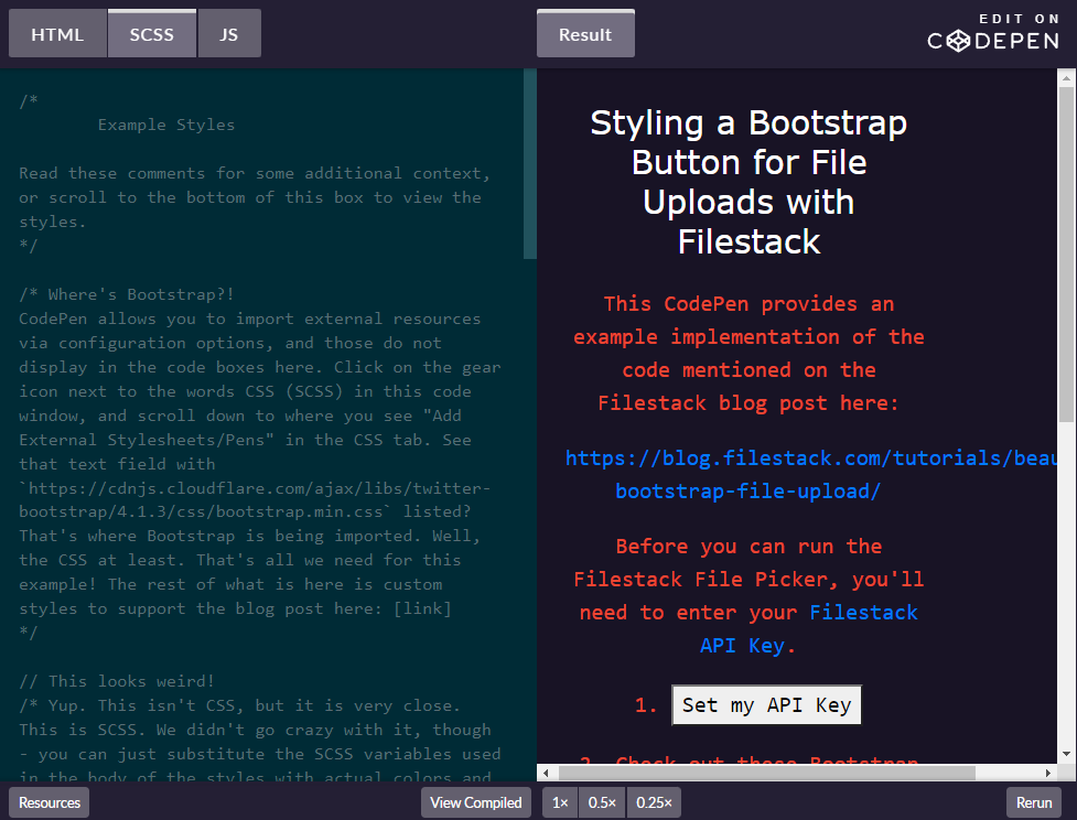
For practice please visit here: https://codepen.io/Filestack/pen/bzEMQG
Bootstrap contains many pre-styled buttons [3], including a default file upload button. For this tutorial, we will apply three different styles to the same Bootstrap button:
The CSS class “btn” of Bootstrap’s base class only defines the initial button shape.
<button class="btn">Upload</button>To extend the base class to include style, Bootstrap uses a second class. The second class comprises two classes: btn and btn-primary.
<button class="btn btn-primary">Upload</button>The button now responds to mouse actions like hovering and focusing.
For further info, you can dig into Bootstrap documentation [4].
now we’ll style the third button by changing the base class btn with a new class, btn-filestack.
here are the CSS classes:
/* Feel free to change the background-color and border-color to fit your website's color scheme */
.btn-filestack {
 background-color: black;
 border-color: #ee4632;
}
.btn-filestack,
.btn-filestack:hover {
 color: #ee4632;
}
.btn-filestack:hover {
 //background-color: #330000;
 box-shadow: 0 2px 2px 0 rgba(256,256,256,0.24), 0 6px 6px 0 rgba(120,120,120,0.19);
}
.btn.btn-filestack:focus {
 color: #fff;
 outline: none;
}
How can I set the right color for Bootstrap file upload?
Showing the right color during a specific state depends on the right settings. You may notice our hover state includes a box shadow. But any style you specify in that style block will apply when the user’s mouse is over the button.
We need to overwrite the original btn style by specifying the text color we wish. The more we change, the more we overwrite default values to achieve the look we want. We chose Filestack’s signature button colors. Feel free to customize it!
With these custom styles in our code, we can now add the following code:
<button class="btn btn-filestack">Upload</button>The button says “Upload,” but nothing will happen if we click it right now. We will add a couple of lines of JavaScript code for that later. We’re looking at the styling only here. We are ready to implement the widget with our company logo, following the Bootstrap philosophy of adding specialized classes!
We want our final button to invite the user to click on it and display the company logo on the left side of the button, like this:

We should reuse the classes btn and btn-filestack plus a new btn-widget CSS class to handle these further customizations:
<button class="btn btn-filestack btn-widget">Pick File</button>Let’s start working on the border and size. Here, we can use border-radius to round the borders and add some padding. Also make sure the font-size is 12px like the original, with font-family set to Open Sans, and font-weight at 600.
Let’s take a look at the CSS:
.btn-widget, .btn-widget:active {
  font-family: "Open Sans", sans-serif;
  font-size: 12px;
  font-weight: 600;
  border-radius: 17px;
  padding: 4px 30px 5px 40px;
  height: 34px;
  /* Set the path of your logo */
  background-image: url('https://www.filestack.com/favicon.ico');
  background-size: 16px 16px;
  background-position: 16px 8px;
  background-repeat: no-repeat;
  line-height: 23px;
}
We also added 34px for the height. Now, let’s add the right arrow. We’ll also map a little UTF-8 character with a hooked arrow onto the button to draw attention to its upload-ness:
.btn-widget::after {
  position: relative;
  content: "\21a9";
  color: rgb(239,74,37);
  top: -0px;
  right: -11px;
  width: 1px;
  height: 12px;
  background: 0 0 no-repeat;
}
Finally, we want to add the company logo to fill the left space.
Next comes icon styling. It’s a bit tricky. We will define a fixed size for the background to equal the icon size and provide a fixed position and the attribute no-repeat. As a result, the background does not cover all the buttons but instead takes care of the icon styling.
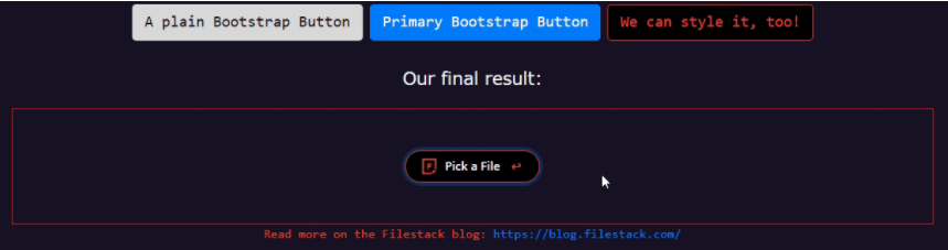
Great, we created an elegant styling you can immediately use on your website!
How can I add the Filestack Pick function for Bootstrap file upload?
To end in style, let’s add a click event listener on the button and see what happens:
<p id="final_result">
  <button id="final_button" class="btn btn-filestack btn-widget">Pick a File</button>
</p>
final_button is the id of the final button. Here we will attach a function triggered by the user’s clicks to launch the Filestack File Picker:
var fs_button = document.querySelector("#final_button");
fs_button.addEventListener("click", function() {
  var client = filestack
  .init(apiKey)
  .picker({
    fromSources: [
      'local_file_system',
      'url',
      // 'imagesearch',
      'facebook',
      'instagram',
      'googledrive',
      'dropbox'
    ]
  }).open();
});
This JS code specifies the options we want for our picker and then opens it up. Nothing initiates until that click, but it happens super-fast. You may choose to put this code outside of the event handler.
Ready to start building robust file upload solutions using Filestack?
FileStack is the #1 developer service for uploads. Get user content from anywhere and improve file or video uploads with powerful, easy-to-use Filestack. It makes API Uploads, URL ingestion, and iOS/Android device integration fast and easy.
Head over to Filestack and sign up for free today!
References:
[1] https://www.techtarget.com/whatis/definition/bootstrap
[2] https://getbootstrap.com/docs/4.0/getting-started/introduction/
[3] https://getbootstrap.com/docs/4.0/components/buttons/
[4] https://getbootstrap.com/docs/5.1/components/accordion/
Filestack is a dynamic team dedicated to revolutionizing file uploads and management for web and mobile applications. Our user-friendly API seamlessly integrates with major cloud services, offering developers a reliable and efficient file handling experience.
Read More →