
Many folks don’t use HTML5 <picture> tag or webp for optimizing images (and they should!)
We’ll explain how to use dynamic image sizing and webp, a new(ish) image format from Google that can make png’s and jpg’s. The results are great. We can reduce a large page from about 30MB to 5MB.
We’ll look at “old school” methods to solve page weight problems caused by heavy image load, then make things simpler with <picture>. Finally, we’ll show you an even easier way to optimize your website’s images using Filestack’s open source “Adaptive” library.
Audits (Why is my page slow?)
Google Chrome developer tools offers an awesome audits panel that helps you diagnose performance and best-practices issues with your website.
We’ll start with a simple website that renders out an image gallery as shown in this codepen.
On the above unoptimized image gallery on codepen, open Chrome Developer tools and check out the audits panel:
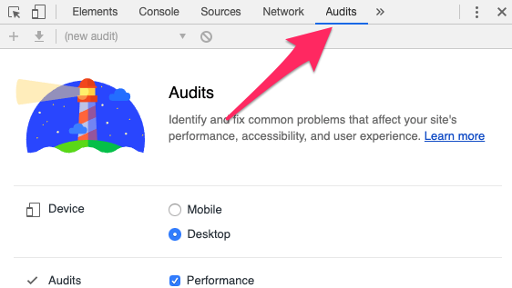
You can decide whether to audit on mobile or desktop, but here, we’ll audit on desktop:
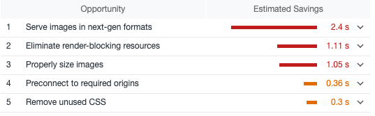
We’ll be looking at improving #1, Serve images in next-gen formats and #3, Properly size images. #2, eliminate render blocking resources is likely specific to CodePen itself and not our gallery.
After looking at this overview, we can peek at the bottom of the devtools network panel to understand the size of all resources loaded:

We can do better.
Serve images in next-gen formats
We’ll be using WebP as our next-gen format. There are several ways to go about this – you could manually create WebP versions of all of your images or you could use a service like Filestack to do it for you, at runtime.
We’ll use Filestack here.
In the example above, this is how we render out our array of baseUrls for images:
baseUrls.forEach(url => {
  imgHTML += `<div><img src="${url}"></div>`;
});
Let’s modify this slightly to change these images to WebP.
  const webpPrefix = 'https://cdn.filestackcontent.com/<YOUR_API_KEY>/output=format:webp'
  imgHTML += `<div><img src="${webpPrefix}/${url}"></div>`;
This runs a backend process that automatically converts and serves images as WebP.
Let’s look at the network panel again:

You can see the results of this experiment at https://codepen.io/Filestack/pen/GVqejV.
Cross Browser WebP
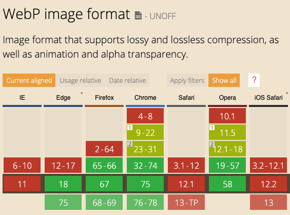
We have another problem. What if the user is on a browser that does not support WebP?

Browsers are almost there, but there are exceptions, notably Safari:
For cross browser support, we’ll need to use the <picture> HTML5 tag. Here’s a standard pattern:
<picture>
  <source srcset="<WEB_P_URL>" type="image/webp">
  <source srcset="<JPG_URL>" type="image/jpeg">
  <img src="<JPG_URL>" alt="Alt Text!">
</picture>
In our case, since we’re rendering HTML with javascript, we’d use something like this:
baseUrls.forEach(url => {
  imgHTML += `
<div>
	<picture>
		<source srcset="${webpPrefix}/${url}" type="image/webp" />
		<source srcset="${url}" type="image/jpeg" />
		<img src="${url}" alt="Alt Text!" />
	</picture>
</div>`;
});
The browser will choose its best option for rendering the image. You can see this in action at https://codepen.io/Filestack/pen/ZgOPLJ.
This one change reduces our payload by about 60%, from 29MB to about 13MB.
The above code also will render in old browsers that don’t support the <picture> tag. In those browsers, <picture> and <source> are ignored, and rendering falls back to the <img> tag.
This is still quite verbose, and we’ll solve this with Filestack’s Adaptive library below. But for now, let’s look at our second problem.
Properly Size Images
We have another problem to solve. We need images to render at approximately the size of the browser window, otherwise we send superfluous data to the client with no benefit to them.
The “Old School” Way
We could solve this with exhaustive media queries and background images (not recommended):
<div class="example"></div>.example{
background-image: url("example_1920_1080.jpg");
}
@media only screen and (max-width: 640px){
.example{
background-image: url("example_640_360.jpg");
}
}
/* ... media queries for every browser size */This looks exhausting. Not only do you need to create multiple images, but you also need to include these type of media queries for every image on your site.
A Better way with <img srcset=… />
A slightly less verbose way would be to use our picture tag with <img> srcset.
<picture>
    <img src="https://cdn.filestackcontent.com/FILESTACK"
         srcset="
            https://site.com/someimage_180w.jpg 360w,
            https://site.com/someimage_720w.jpg 720w,
            https://site.com/someimage_1080w.jpg 1080w,
         alt="photo_01"
         sizes="100vw">
</picture>
This tells the browser to use the appropriately sized image based on the rendered width of our image.
Again, we’d need to manually create and store images of all these sizes on our server for this to work out-of-the box. We’ll skip the CodePen for this example because of the overall tedium of setting up all of those images.
Adaptive
Let’s look at a much simpler (and automated) way to do this type of image optimization with Adaptive from Filestack. Adaptive supports WebP, image resizing and cross browser functionality so that you know you’ll be getting the highest quality image at the lowest download cost every time. You also won’t need to manually resize images or create a backend service to do that for you.
This example can be found at https://codepen.io/Filestack/pen/LKvLgp

We’ll include adaptive as a <script> tag in the Codepen, but if you’re using React, Angular, Vue, or another framework that uses webpack, you’ll likely want to npm install filestack-adaptive as described in the Adaptive Readme.
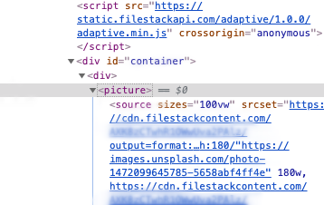
First, we add the <script> tag to our HTML:
<script src="https://static.filestackapi.com/adaptive/1.0.0/adaptive.min.js" crossorigin="anonymous"></script>Next we modify our code:
const FILESTACK_API_KEY="YOUR API KEY";

const options = {
  alt: 'An Image',
  formats: ['webp', 'jpg'], //order matters!
  sizes: {
    fallback: '100vw',
  }
};

const container = document.getElementById('container');
baseUrls.forEach(url => {
  const alias = {
        srcHandle: url,
        apiKey: FILESTACK_API_KEY
      };

  const div = document.createElement('div');
  const picture = fsAdaptive.picture(alias, options);

  div.appendChild(picture);
  container.appendChild(div);
});
Let’s break this down:
const options = {
  alt: 'An Image',
  formats: ['webp', 'jpg'], //order matters!
  sizes: {
    fallback: '100vw',
  }
};
These are options that tell Adaptive to use the alternate tag “An Image”, and serve images in either webp or jpg format (with the newer and smaller webp format taking precedence).
In our foreach loop, we create an alias for each image url using our API key:
  const alias = {
        srcHandle: url,
        apiKey: FILESTACK_API_KEY
      };
Each element then is converted to an HTML.
Then we create a div and append our picture to it and add it to our container DOM:
  const div = document.createElement('div');
  const picture = fsAdaptive.picture(alias, options);

  div.appendChild(picture);
  container.appendChild(div);
Under the hood
Internally, there is some fancy stuff going on in the Filestack Adaptive library. I encourage you to inspect the picture elements that are generated to fully understand how various formats and sizes of images are sent to the browser for rendering.
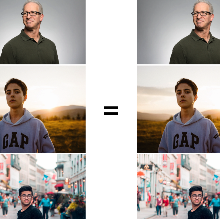
Our final optimization results
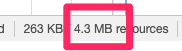
You can see our final results at https://codepen.io/Filestack/pen/RzOgqp. In a mobile browser-like window, the total payload of the site (including codepen’s own resources), we’ve gotten our 29MB page down to just 4.3MB!
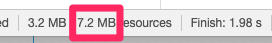
On a large version of the page (1080px wide) the payload is just 7.2MB, and there is no quality change at all to the end user of the website.
Still not small enough? Adjust the lossiness levels.
If you’re willing to sacrifice just a little bit of image quality, the Adaptive library can also adjust the quality level of lossy images.
const options = {
  alt: 'An Image',
  formats: ['webp', 'jpg'], //order matters!
  sizes: {
    fallback: '100vw',
  },
  transforms: {
    quality: {
      value:80
    }
  }
};
Notice the transforms section above. Generally, users will not be able to detect degradation in the 70-80 quality index range. You can experiment with the quality level to get the right balance of size and speed for your site.
Wrapping Up
We looked at how to manually fix up a gallery of high resolution images using the HTML5 <picture> tag, and the how to use new image format, WebP. Then we discovered the ways to render our images at a lower resolution for various devices using minimal javascript code.
We also looked at how Filestack’s Adaptive library could simplify the process for us by rendering our images in <picture> format with a variety of sizes and formats for high quality cross-browser performance. There was no backend code (ImageMagick or otherwise) that we needed to write.
Our results were great; we lowered the entire payload of our site from 29MB to 7.2MB (on a full 1080p display) or 4.3MB (on a mobile device)..
Consider grabbing a free API key from Filestack and to try out the Adaptive library today!
Filestack is a dynamic team dedicated to revolutionizing file uploads and management for web and mobile applications. Our user-friendly API seamlessly integrates with major cloud services, offering developers a reliable and efficient file handling experience.
Read More →