You’ve spent months polishing your app. The UI is clean, the state management is sound, and the user flow is logical. Then someone needs to upload a file.
Suddenly, that generic, unstyled widget appears, looking like it was teleported from 2005. It breaks the entire experience and quietly signals to the user, “we gave up on this part.”
The file uploader is a weird blind spot where even great apps just surrender to the default. It’s a small detail, but it’s a trust issue. Users are handing you their files. The moment of exchange shouldn’t feel janky.
The good news is you can fix this, and you can do it with the tools you’re already using. We’ve overhauled the Filestack picker so you can style it from the ground up with Tailwind CSS. Because let’s be honest, it’s 2025. You’re probably using Tailwind.
The Goal: Stop Fighting CSS
Here’s the core idea. Our picker now has stable, predictable class names (.fsp-picker, .fsp-button–primary, etc.). With the new 4.0 Filestack update, you can target them directly and use Tailwind’s @apply directive to compose utility classes into custom styles. No more specificity wars or spamming !important (mostly).
For this demo, we’ll use the Tailwind CDN to get straight to the point. In production, you should install it as a PostCSS plugin. You know this.
Let’s Build a Better Uploader
We’re not just changing a few brand colors. We’re rethinking the micro-interactions to make the uploader feel like it belongs in your app.
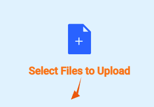
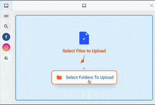
1. A Dropzone That Responds to the User
First, let’s give the user clear feedback that the dropzone is interactive.
The Bouncing Title
When a user hovers over the dropzone, the title provides a clear, unmissable cue.
/* Define the animation */
@keyframes bounce-in {
    0%   { transform: scale(1); }
    50%  { transform: scale(1.25) translateY(-10px); }
    100% { transform: scale(1); }
}

/* Apply it to the title on the parent's hover state */
.fsp-picker .fsp-drop-area:hover .fsp-drop-area__title {
    animation: bounce-in 0.6s ease-in-out;
    @apply text-orange-500 font-bold !important;
}
It’s a small detail that makes the interface feel alive and responsive.
Text-to-Icon Transformation
This is a clean, CSS-only way to add context. The “Drag and Drop” text is replaced by an animated mouse icon on hover. No JavaScript required.
/* 1. Hide a mouse pointer icon on the subtitle element */
.fsp-picker .fsp-drop-area__subtitle::after {
    content: '';
    background-image: url("data:image/svg+xml,..."); /* Your SVG data */
    @apply absolute top-1/2 left-1/2 w-10 h-10 -translate-x-1/2 -translate-y-1/2 opacity-0 transition-all duration-700;
}

/* 2. On hover, make the original text transparent... */
.fsp-picker .fsp-drop-area:hover .fsp-drop-area__subtitle {
    @apply text-transparent !important;
}

/* 3. ...and reveal the icon. */
.fsp-picker .fsp-drop-area:hover .fsp-drop-area__subtitle::after {
    @apply opacity-100 scale-125 !important;
}
The Helpful Folder Icon

Let’s guide the user by showing them what the “Select Folders” button does before they even click. On hover, a folder icon slides in from the left.
/* Create a hidden folder icon to the left of the button */
.fsp-picker .fsp-drop-area__button::before {
    content: '';
    background-image: url("data:image/svg+xml,..."); /* Folder SVG data */
    @apply absolute top-1/2 left-4 w-6 h-6 -translate-y-1/2 opacity-0 transition-all duration-300 -translate-x-4;
}

/* On hover, reveal the icon and add padding to make room */
.fsp-picker .fsp-drop-area__button:hover::before {
    @apply opacity-100 translate-x-0;
}
.fsp-picker .fsp-drop-area__button:hover {
    @apply pl-14 !important;
}
2. Buttons That Communicate Status

Static buttons are a missed opportunity.
The Animated Badge
The badge showing the number of selected files should draw the eye. Let’s make it pop on hover.
/* Base style for the badge */
.fsp-picker .fsp-footer .fsp-button-upload .fsp-badge {
    @apply bg-orange-500 text-white font-bold rounded-full text-xs px-2 py-1 ml-2 transition-all duration-300 transform-gpu !important;
}

/* Animate it when the parent button is hovered */
.fsp-picker .fsp-footer .fsp-button-upload:hover .fsp-badge {
    @apply bg-orange-400 scale-125 rotate-12 !important;
}
3. Unambiguous Actions
Finally, let’s polish the details that improve usability.

The Confident “Remove” Button
Removing a file is a destructive action. The interaction needs to be obvious. We’ll give the ‘X’ button a bold red ring on hover so there’s no question what it does.
.fsp-picker .fsp-summary__action--remove {
    @apply transition-all duration-300 !important;
}

.fsp-picker .fsp-summary__action--remove:hover {
    @apply scale-125 ring-2 ring-red-500 rounded-full !important;
}
Final Working Demo
Your Uploader, Your Styles
This isn’t a hack. We built this functionality directly into Filestack. You get the keys to the entire design without having to build the underlying upload logic.
Want the progress bar to pulse with your brand colors? Do it. Want thumbnails to flip over like cards? Go for it. Want to add confetti when an upload completes? Please don’t, but you could.
Your file uploader no longer has to be the one generic component that breaks your user experience. It can be as polished as the rest of your app. We handled the hard parts so you can get back to work. If you want to see this in action, we published a new video regarding styling the picker with the same CSS styles.
Full Code Snippet
<!DOCTYPE html>
<html lang="en">
<head>
<meta charset="UTF-8">
<meta name="viewport" content="width=device-width, initial-scale=1.0">
<title>Filestack 4.0 Features Showcase</title>
<!-- Tailwind CSS -->
<script src="https://cdn.tailwindcss.com"></script>
<!-- Filestack JS -->
<script src="https://static.filestackapi.com/filestack-js/4.x.x/filestack.min.js"></script>
<!-- Google Fonts for a nicer look -->
<link rel="preconnect" href="https://fonts.googleapis.com">
<link rel="preconnect" href="https://fonts.gstatic.com" crossorigin>
<link href="https://fonts.googleapis.com/css2?family=Inter:wght@400;500;700;900&display=swap" rel="stylesheet">
<style type="text/tailwindcss">
/* Base body styling */
body {
font-family: 'Inter', sans-serif;
}
/* --- NEW: Custom Keyframe Animation for Bouncing Effect --- */
@keyframes bounce-in {
0% {
transform: scale(1);
}
50% {
transform: scale(1.25) translateY(-10px);
}
100% {
transform: scale(1);
}
}
/* --- Filestack Picker Customization with @apply --- */
/* Main modal container */
.fsp-picker .fsp-modal-content {
@apply shadow-2xl rounded-xl !important;
}
/* Modal Header */
.fsp-picker .fsp-header {
@apply bg-slate-50 text-slate-700 border-b border-slate-200 !important;
}
/* Primary 'Upload' button */
.fsp-picker .fsp-button--primary {
@apply bg-sky-600 text-white border-none rounded-lg shadow-md transition-all duration-300 ease-in-out !important;
}
.fsp-picker .fsp-button--primary:hover {
@apply bg-sky-500 -translate-y-1 shadow-xl scale-105 text-lg !important;
}
/* Cancel button styling */
.fsp-picker .fsp-button--cancel {
@apply bg-slate-200 text-slate-700 border-none rounded-lg transition-all duration-300 ease-in-out !important;
}
.fsp-picker .fsp-button--cancel:hover {
@apply bg-slate-300 text-slate-800 scale-105 text-lg !important;
}
/* Left sidebar/source list */
.fsp-picker .fsp-source-list {
@apply bg-slate-100 border-r border-slate-200 !important;
}
.fsp-picker .fsp-source-list__item {
@apply transition-all duration-300 !important;
}
.fsp-picker .fsp-source-list__item--active {
@apply bg-sky-100 text-sky-700 font-semibold !important;
}
.fsp-picker .fsp-source-list__item:hover {
@apply bg-slate-200 translate-x-1 font-semibold !important;
}
/* --- Drop Area Styling --- */
.fsp-picker .fsp-drop-area {
@apply border-2 border-dashed border-sky-400 bg-sky-50 rounded-lg transition-all duration-500 !important;
}
.fsp-picker .fsp-drop-area:hover {
@apply border-solid border-sky-600 bg-sky-100 scale-105 !important;
}
/* --- NEW: Title with Bouncing Animation on Hover --- */
.fsp-picker .fsp-drop-area__title {
@apply transition-all duration-500 !important;
}
.fsp-picker .fsp-drop-area:hover .fsp-drop-area__title {
animation: bounce-in 0.6s ease-in-out;
@apply text-orange-500 font-bold !important;
}
/* --- 'Select Folders' Button with Hover Icon --- */
.fsp-picker .fsp-drop-area__button {
@apply relative text-sky-700 bg-white rounded-lg shadow-lg transition-all duration-300 !important;
}
.fsp-picker .fsp-drop-area__button:hover {
@apply shadow-xl -translate-y-1 scale-110 ring-2 ring-orange-500 ring-offset-2 text-lg !important;
}
.fsp-picker .fsp-drop-area__button::before {
content: '';
background-image: url("data:image/svg+xml,%3csvg xmlns='http://www.w3.org/2000/svg' viewBox='0 0 24 24' fill='%23f97316'%3e%3cpath d='M10 4H4c-1.11 0-2 .89-2 2v12a2 2 0 0 0 2 2h16a2 2 0 0 0 2-2V8c0-1.11-.89-2-2-2h-8l-2-2z'/%3e%3c/svg%3e");
@apply absolute top-1/2 left-4 w-6 h-6 -translate-y-1/2 bg-no-repeat bg-center bg-contain opacity-0 transition-all duration-300 -translate-x-4;
}
.fsp-picker .fsp-drop-area__button:hover::before {
@apply opacity-100 translate-x-0;
}
.fsp-picker .fsp-drop-area__button:hover {
@apply pl-14 !important;
}
/* --- Subtitle to Icon Transformation (Slower) --- */
.fsp-picker .fsp-drop-area__subtitle {
@apply text-sky-600 font-medium transition-all duration-700 relative !important; /* Slower duration */
}
.fsp-picker .fsp-drop-area__subtitle::after {
content: '';
background-image: url("data:image/svg+xml,%3csvg xmlns='http://www.w3.org/2000/svg' viewBox='0 0 24 24' fill='%23ea580c'%3e%3cpath d='M13.6,1.6l-2.9,15.3l-3.3-3.4l-3.2,8.4l8.3-3.2l-3.4-3.3L13.6,1.6z'/%3e%3c/svg%3e");
@apply absolute top-1/2 left-1/2 w-10 h-10 -translate-x-1/2 -translate-y-1/2 bg-no-repeat bg-center bg-contain opacity-0 transition-all duration-700; /* Slower duration */
}
.fsp-picker .fsp-drop-area:hover .fsp-drop-area__subtitle {
@apply text-transparent !important;
}
.fsp-picker .fsp-drop-area:hover .fsp-drop-area__subtitle::after {
@apply opacity-100 scale-125 !important;
}
/* File grid items */
.fsp-picker .fsp-grid__cell {
@apply rounded-lg transition-all duration-300 !important;
}
.fsp-picker .fsp-grid__cell:hover {
@apply bg-slate-100 shadow-xl scale-105 rotate-1 !important;
}
.fsp-picker .fsp-grid__cell--selected {
@apply bg-sky-100 ring-4 ring-sky-500 !important;
}
/* --- Footer and Footer Buttons --- */
.fsp-picker .fsp-footer {
@apply bg-slate-100/80 backdrop-blur-sm border-t border-slate-200 p-3 !important;
}
.fsp-picker .fsp-footer .fsp-button--cancel {
@apply bg-white text-slate-600 border border-slate-300 rounded-lg shadow-sm transition-all duration-300 ease-in-out !important;
}
.fsp-picker .fsp-footer .fsp-button--cancel:hover {
@apply bg-slate-50 text-slate-800 scale-105 ring-2 ring-orange-400 ring-offset-1 !important;
}
.fsp-picker .fsp-footer .fsp-button-upload .fsp-badge {
@apply bg-orange-500 text-white font-bold rounded-full text-xs px-2 py-1 ml-2 transition-all duration-300 transform-gpu !important;
}
.fsp-picker .fsp-footer .fsp-button-upload:hover .fsp-badge {
@apply bg-orange-400 scale-125 rotate-12 !important;
}
/* --- Summary View Remove Button (Updated) --- */
.fsp-picker .fsp-summary__action--remove {
@apply transition-all duration-300 !important;
}
.fsp-picker .fsp-summary__action--remove:hover {
@apply scale-125 ring-2 ring-red-500 rounded-full !important; /* Red border instead of glow */
}
</style>
</head>
<body class="bg-slate-100 flex items-center justify-center min-h-screen p-4">
<div class="w-full max-w-4xl mx-auto">
<div class="bg-white rounded-2xl shadow-xl p-6 md:p-10 text-center">
<header class="mb-10">
<h1 class="text-4xl font-bold text-slate-800 mb-2">Filestack & Tailwind CSS</h1>
<p class="text-slate-500">A live demo of a beautifully branded file uploader.</p>
</header>
<main
class="p-8 border-2 border-dashed rounded-2xl bg-slate-50 flex flex-col justify-center items-center min-h-[300px]">
<h2 class="text-2xl font-bold text-slate-800 mb-2">Ready to Upload?</h2>
<p class="text-slate-600 mb-8 max-w-md">Click the button below to launch the picker. Notice how the
styles we defined create a seamless, branded experience.</p>
<button id="custom-picker-btn"
class="bg-gradient-to-r from-sky-500 to-indigo-500 text-white font-bold py-4 px-8 rounded-xl transition-all duration-300 ease-in-out shadow-lg hover:shadow-2xl focus:outline-none focus:ring-4 focus:ring-offset-2 focus:ring-sky-300 transform hover:-translate-y-2 hover:scale-110 hover:rotate-1 hover:from-indigo-600 hover:to-sky-600 active:scale-95">
Launch Branded Uploader
</button>
</main>
</div>
</div>
<script>
// --- IMPORTANT ---
// --- Replace 'YOUR_API_KEY' with your actual Filestack API key. ---
const API_KEY = ''
if (API_KEY === 'YOUR_API_KEY' || !API_KEY) {
// Find the main content div and replace it with an alert message
const mainContainer = document.querySelector('.w-full.max-w-4xl.mx-auto');
if (mainContainer) {
mainContainer.innerHTML = `
<div class="bg-white rounded-xl shadow-lg p-10 text-center">
<h2 class="text-2xl font-bold text-red-600 mb-4">Configuration Needed</h2>
<p class="text-slate-600">Please replace <strong>'YOUR_API_KEY'</strong> with your actual Filestack API key in the <script> section of this file to enable the demo.</p>
</div>
`;
}
} else {
const client = filestack.init(API_KEY);https://docs.google.com/document/d/1XSpxQGyg8Kyl7IA2pex_OG5FZN-UVMvAvrNL8VZlI6c/edit?tab=t.0
// --- Filestack Initializations ---
function initCustomUploader() {
const customPickerBtn = document.getElementById('custom-picker-btn');
const customOptions = {
maxFiles: 20,
onUploadDone: (res) => {
console.log('Custom Uploader Done:', res);
// You could add a success message to the UI here
},
onClose: () => {
console.log('Picker closed.');
}
};
customPickerBtn.addEventListener('click', () => {
client.picker(customOptions).open();
});
}
// Initialize the picker when the script loads
initCustomUploader();
}
</script>
</body>
</html>
A Product Marketing Manager at Filestack with four years of dedicated experience. As a true technology enthusiast, they pair marketing expertise with a deep technical background. This allows them to effectively translate complex product capabilities into clear value for a developer-focused audience.
Read More →