If you work on web-related tasks, then you have heard about Bootstrap file uploads. If you already have an great website but want to add Bootstrap file uploads, or you are a beginner with a basic understanding of HTML and CSS but want to be a bootstrap file upload expert, this article is for you.
Before digging into bootstrap file uploads, you need to grasp the basics. After that, we will explain how to implement a file uploader using Bootstrap and Filestack.
For basic file uploads, the Filestack API comes up with an out-of-the-box guide. This guide tells you how to upload files from multiple sources. These sources include Facebook, Twitter, Google Drive, Webcam, and more. After each file upload, FileStack automatically generates a CDN URL that you can immediately use in your application.
Finally, we will use Bootstrap to re-style the file upload button to match your brand.
Alright, let’s start!
What are Bootstrap and Bootstrap file uploads?
Bootstrap quickly became popular after its open-source release in 2011. This is because it offers many advantages. For example, Bootstrap is free. It is also an open-source HTML, CSS, and JavaScript framework that makes websites responsive. It is the most popular front-end framework for quick and easy mobile-friendly website building.
Bootstrap was initially built for Twitter. Now, however, it is a popular framework for cross-browser compatibility. It provides rich extensibility using JavaScript, with built-in support for jQuery plugins and a programmatic JavaScript API.
Bootstrap is compatible with any IDE or editor and any server-side technology and language. It supports everything from ASP.NET to PHP and Ruby on Rails.
Finally, the Bootstrap file uploader is user-friendly and eye-catching. It is also perfect for stylish button design and file uploads using integrated JavaScript plugins or a dedicated file uploader like Filestack.
Why is Bootstrap great?
These are the advantages of Bootstrap:
- Bootstrap is foolproof because it consists of fundamental HTML elements and global CSS settings design templates and is easy to use.
- It contains many reusable components for typography, forms, tables, navigation, modals, buttons, image carousels, and many others.
- It has Cross-browser compatibility with all modern browsers like Chrome, Firefox, Internet Explorer, Safari, Opera, etc.
- Bootstrap components are customizable. You can customize Bootstrap’s elements and jQuery plugins to build your style responsive website.
- Moreover, Bootstrap is straightforward to extend and adapt to a specific color scheme. For instance, we can provide a “Filestack feel” by changing the button colors and adding an image and glyph.
How can I get started with Bootstrap file upload?
This article focuses on building different types of stylish upload buttons. This is because for basic file uploading functionality we will use Filestack. To be an expert in Bootstrap file upload, a basic knowledge of Bootstrap components like button classes, button sizes, color pickers, border, and size is essential.
In the end, we will answer the following questions about Bootstrap file upload:
- What is the number of available Bootstrap Buttons classes, what are their sizes and when do you use each?
- How do you map a little UTF-8 character with a hooked arrow onto the button?
- What is the method for attaching a function where user clicks will trigger and launch the Filestack File Pick?
To add a button in Bootstrap, there are seven styles that you can use. These are essential for building a Bootstrap file upload feature.
.btn-default
.btn-primary
.btn-success
.btn-info
.btn-warning
.btn-danger
.btn-link
<!DOCTYPE html>
<html lang="en">
  <head>
     <title>Job</title>
     <link rel="stylesheet" href="https://maxcdn.bootstrapcdn.com/bootstrap/3.3.6/css/bootstrap.min.css"/>
  </head>
  <body>
    <h1>Button Example!</h1>

<button class="btn btn-default">default</button>
<button class="btn btn-primary">primary</button>
<button class="btn btn-danger">danger</button>
<button class="btn btn-success">success</button>
<button class="btn btn-info">info</button>
<button class="btn btn-warning">warning</button>
<button class="btn btn-link">Link</button>

<script src="https://ajax.googleapis.com/ajax/libs/jquery/1.11.3/jquery.min.js"></script>
  <script src="https://maxcdn.bootstrapcdn.com/bootstrap/3.3.5/js/bootstrap.min.js"></script>
  </body>
</html>
Visit the Bootstrap Official Documentation.
There are four button sizes in Bootstrap, and you can choose each button size according to your needs.
The following classes define the different sizes:
.btn-lg
.btn-md
.btn-sm
.btn-xs
Example use:
Button classes are used on an <a>, <button>, or <input> elements. You have to apply them when you build the Bootstrap file upload button:
<a href="#" class="btn btn-info" role="button">Link Button</a>
<button type="button" class="btn btn-info">Button</button>
<input type="button" class="btn btn-info" value="Input Button">
<input type="submit" class="btn btn-info" value="Submit Button">
For more information, you can visit Bootstrap’s Official Documentation.
What are the steps in Bootstrap file upload?
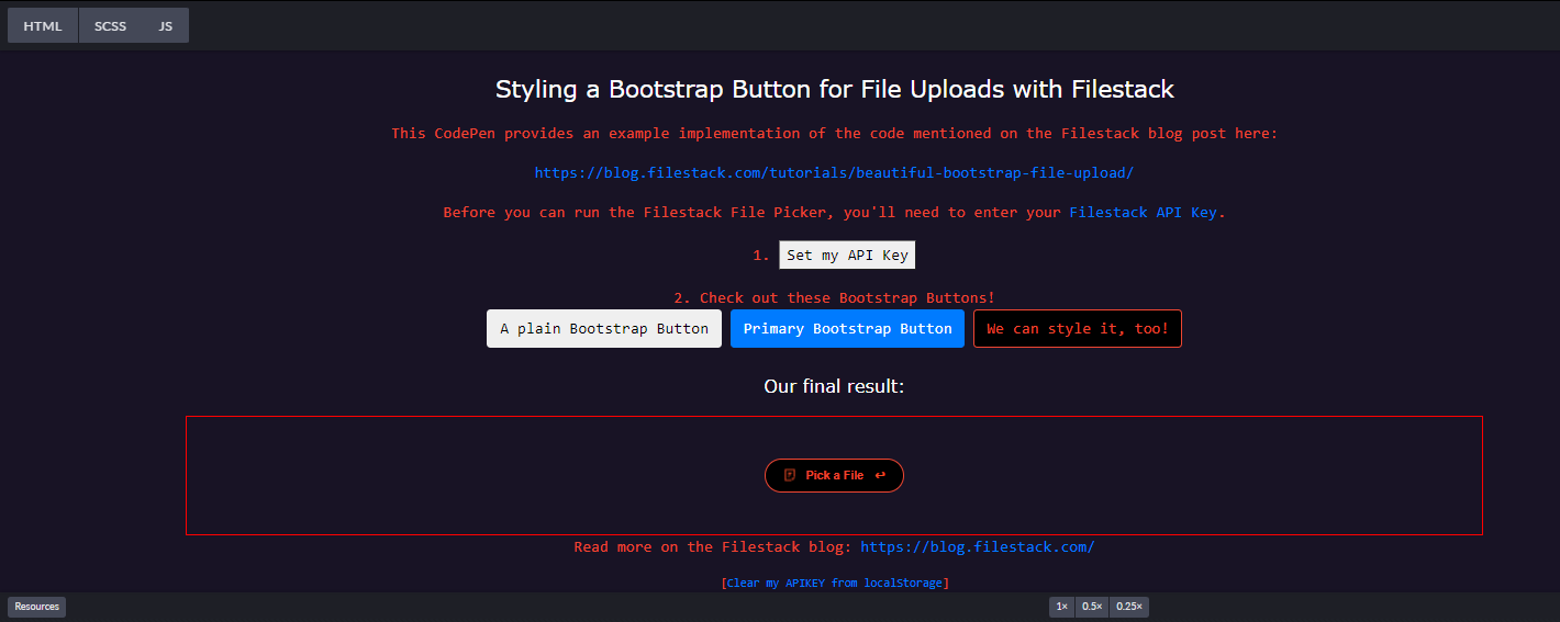
Let’s begin with a user upload button. A button click opens the file uploader or file picker. You can either host the Bootstrap assets on your server or link to a CDN copy of the files. If you are trying this out in CodePen, simply search for Bootstrap in CSS Options to add it to your pen. It will work fine.
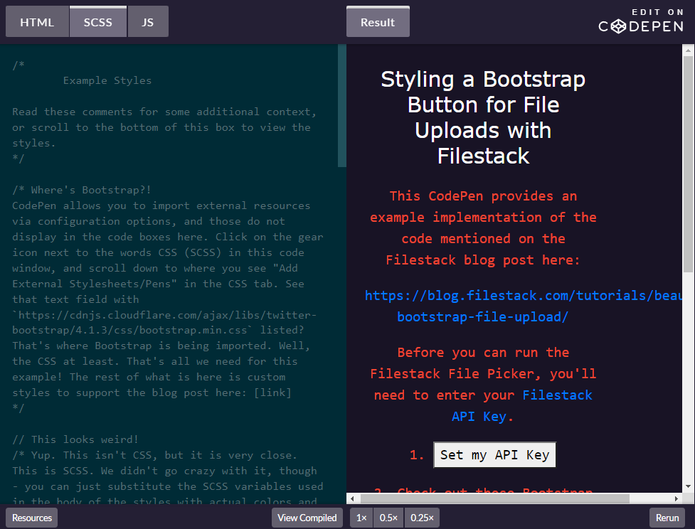
For more information please visit: https://codepen.io/Filestack/pen/bzEMQG
Bootstrap shows many pre-styled buttons, including a default file upload button. Here are three different styles applied to the same Bootstrap button:

Bootstrap’s base CSS class “btn” only defines the initial button shape.
<button class="btn">Upload</button>To extend the baser class with style, Bootstrap uses a second class. It comprises two classes: btn and btn-primary.
<button class="btn btn-primary">Upload</button>The button now responds to mouse actions like hover and focus. If you want to learn more, you can dig into Bootstrap Documentation.
We will style the third button to follow the same strategy to engage base class btn alongside a new class btn-filestack.
Please take a look at the CSS class first:
/* Feel free to change the background-color and border-color to fit your website's color scheme */
.btn-filestack {
 background-color: black;
 border-color: #ee4632;
}
.btn-filestack,
.btn-filestack:hover {
 color: #ee4632;
}
.btn-filestack:hover {
 //background-color: #330000;
 box-shadow: 0 2px 2px 0 rgba(256,256,256,0.24), 0 6px 6px 0 rgba(120,120,120,0.19);
}
.btn.btn-filestack:focus {
 color: #fff;
 outline: none;
}
Setting the right color
Setting the right color means choosing the correct color for a specific state. For example, our hover state includes a box-shadow, but any styles you specify in the styles block are applied when the user’s mouse hovers over the specific button.
Also, note that we need to override the original btn style by specifying the text color we want. The more we change, the more we override the defaults to achieve the look we want.
Here we will use Filestack’s signature button colors but feel free to customize them. Because we have these custom styles in our code, we can do the following:
<button class="btn btn-filestack">Upload</button>The button says “Upload,” but when we click it, nothing happens. We’ll add a few lines of JavaScript for this later because right now we are only looking at styles.
Following the Bootstrap philosophy of adding specialized classes, we are ready to implement widgets with our brand logo.
Before going further, let’s get a clear concept of what we’re attempting to accomplish. Our final button should invite the user to click it and display a logo on the left side of the button, as shown below:

We create this customization by reusing the classes” btn ” along with “btn-filestack” and adding a new “btn-widget” CSS class.
<button class="btn btn-filestack btn-widget">Pick File</button>Border and size
Now let’s start working on border and size:
We can easily use the border-radius to round the borders and add padding. Moreover, we set the font size at 12px, similar to the original font family. We also set the font to Open Sans with a font-weight of 600.
Let’s look at the CSS:
.btn-widget, .btn-widget:active {
  font-family: "Open Sans", sans-serif;
  font-size: 12px;
  font-weight: 600;
  border-radius: 17px;
  padding: 4px 30px 5px 40px;
  height: 34px;
  /* Set the path of your logo */
  background-image: url('https://www.filestack.com/favicon.ico');
  background-size: 16px 16px;
  background-position: 16px 8px;
  background-repeat: no-repeat;
  line-height: 23px;
}
Here, we also specified 34px for the height.
Now, let’s add something special, the right arrow.
To draw attention to the button, we’ll map a little UTF-8 character with a hooked arrow onto it.
.btn-widget::after {
  position: relative;
  content: "\21a9";
  color: rgb(239,74,37);
  top: -0px;
  right: -11px;
  width: 1px;
  height: 12px;
  background: 0 0 no-repeat;
}
Then we can finally add the logo to fill the left space.
Styling the icon
Styling the icon is a little bit tricky. You need to use few words to maintain a fixed size so the background equals the icon size. After that add a fixed position and the no-repeat attribute. The background doesn’t cover the entire button — instead, it takes care of the icon styling.
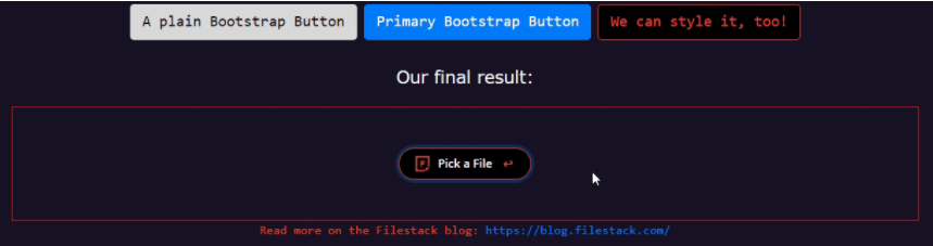
Multiple Bootstrap File Upload Button Styles
In just a few minutes, we just created elegant styling you can immediately use on your website!
How does the Filestack pick function work?
To end in style, let’s go next and add a click event listener on the button:
<p id="final_result">
  <button id="final_button" class="btn btn-filestack btn-widget">Pick a File</button>
</p>
final_button is the id of the final button. Let’s attach a function that a user click will trigger to launch the Filestack File Picker:
var fs_button = document.querySelector("#final_button");
fs_button.addEventListener("click", function() {
  var client = filestack
  .init(apiKey)
  .picker({
    fromSources: [
      'local_file_system',
      'url',
      // 'imagesearch',
      'facebook',
      'instagram',
      'googledrive',
      'dropbox'
    ]
  }).open();
This JavaScript code specifies the options we want for our picker then opens it up. Until that click, nothing is initialized, but everything happens quickly. Remember, you can also put this JavaScript code outside the event handler.
Hopefully, this inspires you. With practice, you can be expert at designing and styling your own upload buttons. Bootstrap is flexible. You can customize any Bootstrap defaults, but you still benefit from the UI framework.
Ready to start building powerful file upload solutions using Filestack?
Get user content from anywhere and improve file or video uploads with powerful, easy-to-use Filestack. It makes API Uploads, URL ingestion, and iOS/Android device integration fast and easy. FileStack is the #1 developer service for uploads.
Head over to Filestack and sign up for free today!
Filestack is a dynamic team dedicated to revolutionizing file uploads and management for web and mobile applications. Our user-friendly API seamlessly integrates with major cloud services, offering developers a reliable and efficient file handling experience.
Read More →