


When it comes to website performance, every second counts. Images often make up the largest assets on a page; thus, improperly managed visuals can significantly slow down your site. That’s what makes image optimization for web performance so important.
Optimizing your images goes beyond aesthetics, impacting your website’s load speed, SEO ranking, and overall user experience. Having a website that performs well improves visitor retention, reduces bounce rates, and remains consistent across most modern platforms. Additionally, it also improves metrics like Large Contentful Paint (LCP), a key part of Google’s Core Web Vitals.
This guide walks you through the key techniques for image optimization to help your site run faster and more efficiently.
Note: Bounce rates refer to a web analytics metric that measures how well a website performs in terms of user engagement. You can calculate it by dividing the total one-page visits by the total entrance visits. Basically, it’s the percentage of sessions that start and end on the same page.
Note: LCP is a web metric that measures how fast a website displays its largest individual content element. The measurement starts from page load until the page “paints” the largest content element on the screen.
Key Takeaways
- Image optimization boosts performance and SEO.
- Large or unoptimized images hurt load times and bounce rates.
- Choose the right file formats (e.g., JPEG for photos, PNG for transparency, SVG for scalable graphics).
- Implement lazy loading and responsive images (srcset and sizes).
- Automate optimization with developer tools like Google Lighthouse for metrics or Filestack for file management.
Why Image Optimization Matters
Before exploring the “what to do” part of image optimization, it’s vital to learn about the “why” part first. Here are the most common reasons why image optimization for web performance should have a high priority:
Impact on Page Load Speed
Large and unoptimized images almost always cause websites to slow down. If your homepage is loading several megabytes (MBs) of image data, users will experience delays. This is especially true on mobile or slower networks.
When a page loads, the browser must download and render all assets. Hence, as the file size of the page contents increases, so does the page’s loading time, disrupting the UX. According to a 2017 research by Google,
- The probability of a bounce rate occurring increases 32% as page load time increases from 1 second to 3 seconds.
- As page load time increases from 1 second to 10 seconds, the probability of bounce increases by a whopping 123%.
- As the number of elements, including images and text, goes from 400 to 6,000, the probability of conversion drops by 95%.
By prioritizing image optimization for web performance, you significantly cut down load times and improve user retention.
SEO and Ranking Benefits
Google uses page speed as a direct ranking factor, especially for mobile-first indexing. As part of its initiative, it introduced Core Web Vitals, a set of user-focused performance metrics for evaluating the UX.
LCP (as mentioned earlier) and Cumulative Layout Shift (CLS) are two of the most image-relevant Core Web Vitals metrics. And as you might have guessed, having images that are poorly optimized can negatively impact them.
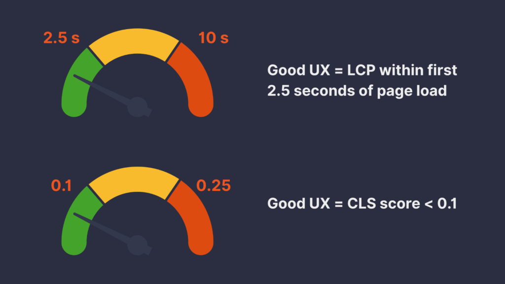
- LCP: Google recommends an LCP time of 2.5 seconds or faster. Sites that exceed this threshold are then considered slow, ranking lower in search results.
- CLS: This metric deals with how much the page layout shifts unexpectedly as the content loads. When an image loads without defined or fixed dimensions, it can cause a site to have a lower CLS score. In turn, the user experience, as well as the site’s ranking, suffers.

By optimizing your images, you not only improve these metrics but also provide a better UX, which search engines reward.
Better Mobile Experience
Mobile users often rely on limited data plans and slower connections. Furthermore, smaller screens such as mobile devices don’t often need larger, high-resolution images. Heavy images drain bandwidth and delay content visibility, leading to poor engagement.
To combat this problem, you can adopt modern image optimization techniques like having a responsive design and adaptive loading. These ensure that mobile users receive appropriate image sizes, saving bandwidth and improving interaction.
Adaptive loading refers to a practice that aims to deliver different (albeit consistent) experiences to users depending on their network and hardware environment. For example, you can deliver only low-quality images and videos on slower networks. Moreover, you can disable non-essential JavaScript (e.g., animations) on slower or older devices.
Common Image Optimization Mistakes to Avoid
When building websites and web applications, you should always consider avoiding these common pitfalls that quietly undermine your site’s performance:
- Using oversized images without resizing. Many websites serve images that are far larger than necessary. For example, some might squeeze a 3000px-wide image into a 300px-wide container, adding unnecessary weight to the page.
- Uploading uncompressed formats. Raw image formats like BMP may preserve maximum detail, but they’re impractically large for the web. These files can slow page loads to a crawl and are often not supported across browsers.
- Relying solely on CMS auto-scaling. Many content management systems (CMS), like WordPress, auto-generate image sizes for different use cases, but these usually aren’t optimized for actual page layouts. You might end up serving larger images than intended or redundant versions of the same file.
- Ignoring mobile-specific image needs. Serving full-width desktop images on mobile devices wastes bandwidth and leads to poor user experiences. For instance, if you have a wide banner for desktop display, it could show up as distorted while slowing down page load.
These are the common pitfalls to avoid, but how do you avoid them, exactly? Let’s discuss that in the following section.
Key Techniques for Image Optimization
Ensuring image optimization for web performance is an often taxing or lengthy process. Thankfully, you now have a wide array of optimization techniques from years of research, experimentation, and improvement.
Choose the Right File Format
Selecting the right format is critical. Each has its strengths. For example, JPEG is ideal for rich, detailed images like photographs, where small compression artifacts are acceptable. PNG works well for graphics that require transparency or crisp edges, like logos and UI images.
WebP and AVIF are newer formats that offer high compression with minimal quality loss, making them great for balancing speed and visuals. SVG is best for simple graphics, icons, and illustrations that need to scale cleanly across devices without pixelation. With SVG, you can even change the color of the images using CSS.
The table below illustrates the differences between each of these file formats. You should try using all or a combination of them most of the time. However, ensure that you determine the proper file type for your use case first.
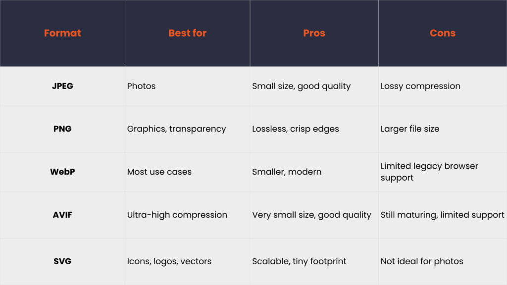
Based on the table above, you’ll want to lean towards WebP or AVIF if you seek maximum performance. Note, however, that these new formats still have limited support across older browsers. So, again, review your requirements first, and then decide on what you’ll use afterwards.
Resize Images to Actual Display Dimensions
Avoid serving a 3000px image in a 300px container. As stated earlier, it’s a waste of bandwidth. Instead, use tools like Photoshop, Squoosh, or TinyPNG to resize images appropriately before uploading.
Compress Images without Losing Quality
Compression can drastically reduce file size. You can compress images in two ways:
- Lossy: removes data to shrink size (ideal for photos). For example, social media platforms often use this when users upload images to reduce file size and save storage space.
- Lossless: retains all data (ideal for graphics). For instance, you can compress files into a ZIP archive. This reduces the overall file size while ensuring that the original data is perfectly restored upon decompression without any quality loss.
Popular tools for compression include ImageOptim (macOS), TinyPNG, ShortPixel, and Cloudinary.
Use Next-Gen Images Formats
As discussed earlier, WebP and AVIF offer significantly smaller file sizes without compromising quality. They are ideal for improving image optimization for web performance, especially on mobile. However, because they’re relatively new, consider:
- Providing fallback formats for unsupported browsers
- Testing compatibility before switching sitewide
Implement Lazy Loading
Lazy loading refers to the practice of delaying the loading of off-screen images until the user scrolls down to them. This dramatically reduces the page’s initial weight, loading only what the user initially sees.
To implement lazy loading, you can either
- Use native lazy loading: <img loading=“lazy”> (supported by most modern browsers). This is simpler to implement and is potentially more efficient than JavaScript. However, this method is limited to image and iframe elements and offers less customization or control behavior.
- Use JS libraries like LazyLoad, Lozad.js, or react-lazyload (for React applications), to name a few. These libraries can often allow you to lazy load content beyond images and iframes, such as background images, videos, and other components. Its downsides include requiring an additional JavaScript file (increasing page size and load time) and a more complex implementation.
Serve Images via CDN

A content delivery network (CDN) stores cached copies of your images on servers around the globe. When a user visits your site, the CDN delivers the image from the nearest server, reducing latency and speeding up load times regardless of user location.
Beyond just proximity, many modern CDNs like Cloudflare, Imgix, and Fastly offer image-specific optimization features. These include automatic format conversion, real-time resizing, and compression.
Use Responsive Images (srcset and sizes)
With srcset and sizes, browsers choose the optimal image version based on device and screen resolution. For example, take a look at the following snippet:
<img
  src="image-800.jpg"
  srcset="image-400.jpg 400w, image-800.jpg 800w, image-1200.jpg 1200w"
  sizes="(max-width: 600px) 400px, 800px"
  alt="Sample Image"
>
In the HTML code above, instead of having just one “src,” the image now has an entire “srcset.” This lists some image source URLs, each followed by a width descriptor, which indicates the intended pixel width of the image. The “sizes” attribute then provides a hint to the browser about the intended size of the image in the final rendered layout. The browser then uses this to select the most appropriate image from the srcset.
Cache Images Effectively
Set long expiration headers (e.g., Cache-Control: max-age=31536000) for static assets. This allows returning visitors to load images from local storage instead of re-downloading them. Use this if you expect your site’s visitors to frequent your site (e.g., social media platforms, LMS, etc.).
Tools to Automate Image Optimization for Web Performance
Manually optimizing every image on your website can cost you time and cause errors, especially as your content library grows. Thankfully, a range of automation tools can streamline and scale your image optimization for web performance efforts.
CMS Plugins: These plugins automatically compress and resize your images as you upload them. For example, WP Smush offers lossless compression, while ShortPixel supports next-gen formats like WebP. These tools for CMS are useful, especially for non-technical users running content-heavy WordPress sites, ensuring automatic image optimization.
Developer Tools: For those managing custom web applications, these tools provide flexible, programmable workflows. For example, ImageMagick lets you batch-resize or convert image formats in your build process. On the other hand, gulp-image and Webpack image loaders integrate optimization into your pipelines.
Cloud Platforms: These services offer comprehensive solutions for image handling, including automatic format conversion, file compression, image resizing, and CDN. Platforms like Filestack, Cloudinary, or Imgix are ideal for teams that want to offload the complexity of image processing and focus on building their core functionality.
By leveraging these tools, you can reduce human error, save time, and maintain high-quality visuals while improving performance for all users.
Monitoring Image Performance
Optimizing images is only part of the process. To truly understand how your efforts impact your site, you need to monitor performance over time using both automated audits and real user metrics.
- Google Lighthouse: A free tool in Chrome DevTools that evaluates how well optimized your site is. It checks image dimensions, file sizes, and whether you’re using modern formats like WebP. It also gives you a score for LCP, helping you measure how quickly key visuals load.
- PageSpeed Insights: Powered by Lighthouse but geared towards both mobile and desktop analysis, this tool shows detailed diagnostics and suggestions. It flags unoptimized images and helps your website improve by giving suggestions based on Core Web Vitals.
- GTmetrix: A tool that provides waterfall charts of all page assets, allowing you to see how and when images load. This is helpful for determining bottlenecks, such as large hero images delaying interactivity or lazy loading assets that fail to defer correctly.
Conclusion
Image optimization for web performance is no longer optional nowadays. Instead, it has served as a foundation for building fast, engaging, and SEO-friendly websites. Whether you’re running a blog, an e-commerce store, or a full-scale web application, you should optimize images to boost performance.
If you’re not yet doing so, try out some of the techniques that we discussed when you have the time. You’ll likely notice significant improvements in terms of speed and page weight almost immediately. You might also notice SEO improvements, albeit at a much slower pace.
For instance, you can try resizing and compressing your images. Or maybe use next-gen formats like WebP or AVIF, coupled with lazy loading and responsive images. You can also try serving your files through a CDN.
Whichever set of techniques you use on your site, you’ll be one step closer to your optimization goal. So, why not start now by auditing your site using tools like Lighthouse or PageSpeed Insights? A faster, smoother web experience is just a few optimizations away.


Carl is a Product Marketing Manager at Filestack with four years of hands-on experience in React, JavaScript, Django, and Python. He bridges the gap between product and developer, translating how Filestack’s APIs and SDKs actually work into content that’s useful for the engineers building with them. His writing covers file handling workflows, upload integrations, and real-world implementation patterns, written from the perspective of someone who has built with these tools firsthand.