
Most developers treat the file upload UI as a solved problem. They add an < input type=”file”>, connect it to the backend, and move on. But real users deal with slow internet, large files, unsupported formats, interrupted uploads, and confusing feedback about whether the upload actually worked.
That’s the difference between something that “works” technically and something that feels smooth and reliable to use. A poor file upload UI design can frustrate users, increase abandoned forms, cause duplicate uploads, and even create extra support requests. In products like SaaS apps, e-commerce platforms, healthcare platforms, and media platforms, file uploads are often a very important part of the user journey.
In this guide, we’ll look at what makes a good upload file UI. We’ll cover the essential components, loading and success states, helpful error messages, and recovery flows that improve the overall experience. We’ll also explore how tools like Filestack handle these challenges, so you can better decide what to build yourself and what to integrate.
Key Takeaways
- A good upload file UI should handle all states properly, including empty, uploading, success, error, and retry states.
- File validation before upload helps prevent common issues like unsupported formats or oversized files.
- Drag-and-drop upload areas should always include a clickable fallback for better accessibility and usability.
- Mobile uploads need features like camera uploads, compression, and retry support for a smoother experience.
- Tools like Filestack simplify functionalities such as resumable uploads, file pickers, and mobile optimisation.
Now, let’s understand why the upload file UI design matters in the first place.
Why Upload File UI Design Matters
The upload file UI is one of the most frustrating parts of many web applications, and a poor experience here can hurt completion rates, reduce user trust, and increase support requests.
File Uploads Are High-Friction Interactions
Users often feel unsure during file uploads. They worry about large files failing, unsupported formats, or losing progress because of a poor internet connection, especially on mobile. Even small UX issues like missing progress indicators, unclear error messages, or drag-and-drop areas without a clickable option can frustrate users enough to abandon the task.
Better Upload UI Improves Completion Rates
A better upload experience leads to higher completion rates. Clear progress updates help users feel confident that the upload is working. Early file validation prevents common errors before users waste time waiting for a failed upload. Features like retry options and resumable uploads also make it easier for users to recover from problems without starting over. Since these improvements reduce frustration and improve usability, upload UX deserves the same attention as onboarding or checkout experiences.
Industries Where Upload UX Is Especially Important
Some industries are affected more by poor upload UX than others:
- SaaS platforms need reliable document uploads for smooth workflows.
- E-commerce marketplaces depend on successful product uploads to maintain catalog quality.
- Healthcare systems must balance easy uploads with compliance and security requirements.
- Education platforms often experience heavy upload traffic during assignment deadlines.
- Media and creative tools need stable uploads for large image and video files.
To create a better upload experience, it’s important to understand the core components behind it.
Core Components of an Effective Upload File UI
A good upload file UI is built with modular file upload components. Each file upload component has a specific role in the upload process, and the overall experience depends on how well these components work together.
Upload Trigger Components
The upload trigger is the starting point of the upload experience. Different upload patterns work better for different use cases:
- Upload buttons are the most common option. Use clear labels like “Upload File” or “Attach Document” and show supported file types or size limits. Avoid unclear labels like “Browse.”
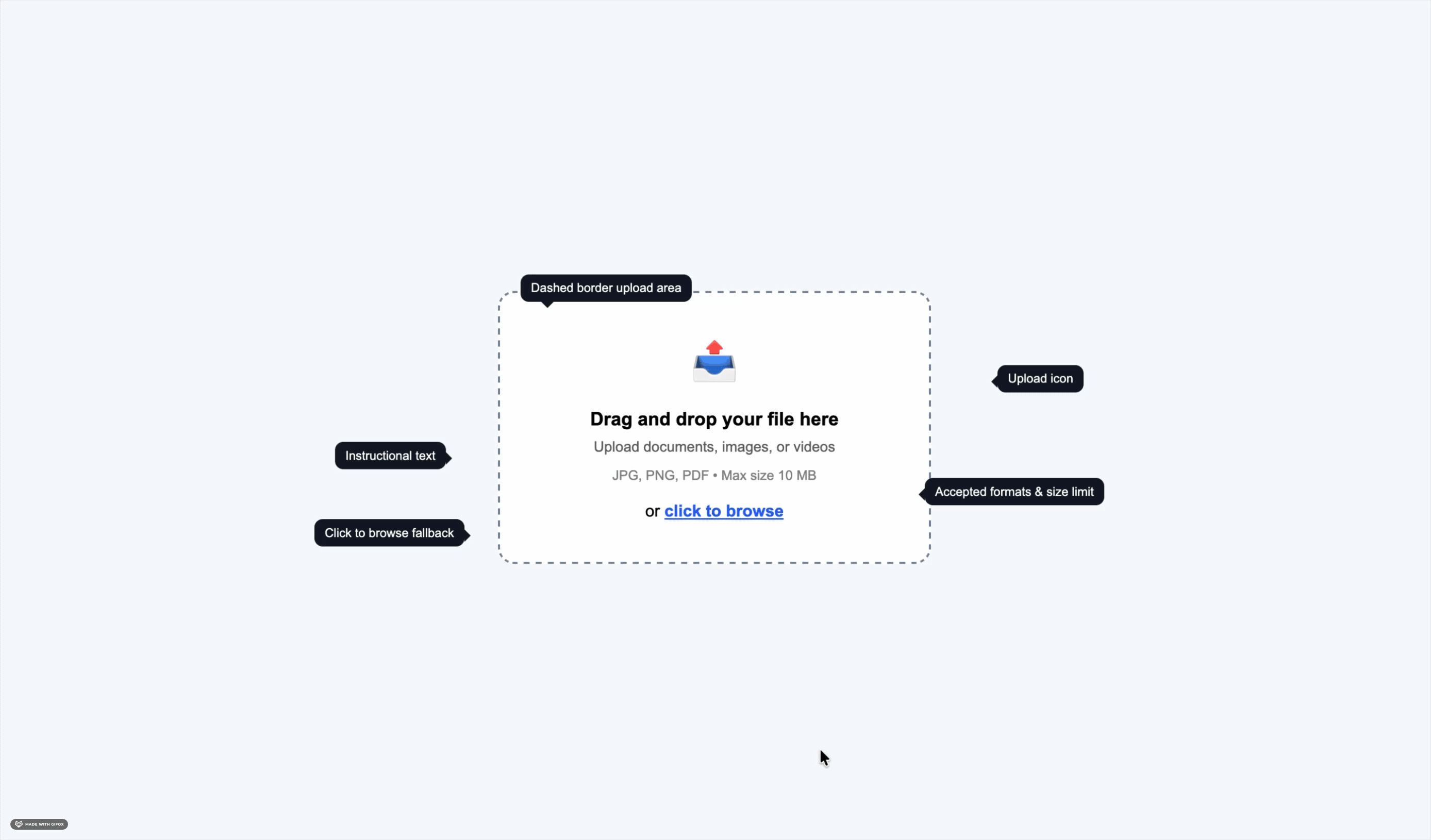
- Drag-and-drop zones work well for desktop users. Provide a large, visually distinct drop area with icons, borders, and instructions to make the interaction feel more intuitive. The drop zone should also highlight when a file is dragged over it. Always include a clickable fallback, such as a file picker, for users who don’t want to drag files.
- Multi-source upload pickers let users upload files from cloud storage, cameras, URLs, or local devices. Filestack supports services like Google Drive, Dropbox, OneDrive, and camera uploads without requiring separate integrations.
File Selection Interfaces
How users choose files is just as important as the upload area itself. Desktop users are comfortable with native file browsers, but mobile file pickers can often feel confusing and cluttered. Making camera uploads a primary option on mobile helps users quickly upload photos or documents with less effort. Cloud storage integrations also improve the experience by letting users upload files directly from services they already use, without downloading and uploading them again.
Upload Queue Management
For multiple file uploads, users should be able to clearly see everything they’ve selected. A good upload queue shows each file’s name, size, and upload progress. It should also let users remove files before or during the upload and display the overall progress for the entire batch. Without these features, batch uploads can feel confusing and difficult to manage.
File Previews Components
File previews help users confirm they selected the correct file before uploading. Using a set of preview patterns or configurations, such as image thumbnails for photos and PDF previews showing document details like file name or page count, can make it easier for users to recognise their files. Showing metadata such as file size and format also helps users feel more confident before they continue.
Once the main components are in place, the next step is designing how the upload behaves in different states.
Designing Upload States the Right Way
Every file upload goes through different stages, all managed by the file uploader component. Designing each state of the file uploader properly, instead of relying on default browser behaviour, helps create a smoother and more reliable upload experience.
Empty State Design
The empty state is the first thing users see before selecting a file. It should clearly explain what users can upload, supported file formats, and file size limits. Showing this information early helps users avoid mistakes and makes the upload process easier to understand from the start.
Active Upload State
Once the upload starts, users need clear real-time feedback. A progress bar with a percentage is the basic requirement. For larger files, showing upload speed and estimated time remaining makes the experience feel more reliable. In chunked uploads, where files are uploaded in parts, progress indicators also help prevent the UI from looking stuck at 0% during the setup process.
Success State Design
The success state is often overlooked in upload UI design. Simply hiding the progress bar is not enough; users need clear confirmation that their file was uploaded successfully. A good success state should show the file name or preview, a confirmation message, and what happens next. This helps users feel confident and reduces duplicate uploads caused by uncertainty.
Failed Upload States
The error state is one of the most important parts of upload UX. Errors should be clearly visible and easy to understand, not hidden in temporary notifications or hard-to-find status areas. A good error message explains the problem in simple language and tells users what to do next. For example, “File too large. Maximum size is 10 MB. Try compressing your file or choose a smaller one.” is much more helpful than a generic “Upload failed” message.
Among all upload states, progress feedback has one of the biggest impacts on user experience.
Best Practices for Upload Progress Indicators
Showing upload progress is one of the most effective ways to improve upload UX and is a key component of effective file upload ui design. It helps reduce user anxiety by clearly showing that the upload is working, how much is complete, and how long it may take.
Why Upload Progress Visibility Matters
Without a progress indicator, users are left guessing whether the upload is working or not. They may refresh the page, retry the upload, or abandon the process entirely, especially on slow internet connections. A visible progress indicator gives users confidence that the upload is moving forward, helps them understand how long it may take, and makes the waiting experience feel more manageable.
Common Progress UI Patterns
Linear progress bars are the most common option. They show upload progress with a horizontal bar and percentage, making them easy for users to understand.
Circular progress indicators work well in smaller UI areas like file thumbnails, icons, or compact mobile layouts.
Chunk upload indicators are useful for large file uploads split into smaller parts. They show how much of the upload is completed and how much is still remaining.
Advanced Progress Feedback Features
Upload speed and time estimates help users understand how the upload is progressing and whether their internet connection is stable. Real-time status messages like “Compressing file…”, “Uploading 3 of 5 parts…”, or “Processing…” also make the experience feel clearer and more predictable instead of leaving users wondering what’s happening.
Even with good progress feedback, uploads can still fail, which is why strong error handling is essential.
Error Handling Strategies That Improve User Experience
Most upload errors can be predicted and prevented. Treating error handling as a core part of the upload experience instead of an edge case helps create a smoother and more reliable experience for users, especially for any platform that relies on file uploads.
Most Upload Failures Are Preventable
The most common upload problems are unsupported file formats, files that are too large, and interrupted internet connections. These issues can often be prevented before they become real failures. File type and size checks can happen before the upload starts, while connection problems can be reduced with retry support and chunked uploads. Designing for these situations from the beginning helps users recover easily instead of getting stuck with failed uploads.
Inline Validation Before Upload Begins
Client-side validation helps catch common upload errors before the upload even starts:
- File size validation checks whether the file exceeds the allowed limit as soon as it’s selected, saving users from waiting for a failed upload.
- File type validation should verify the actual MIME type instead of only checking the file extension, since file names can be easily changed.
- Resolution validation is useful for image uploads that require minimum dimensions or quality standards. Checking this before upload helps avoid processing issues later.
Effective Upload Error Messaging
Good upload error messages should follow three simple rules:
- Be clear about the problem, “Unsupported file type. Please upload a JPG, PNG, or PDF” is much more helpful than “Invalid file.”
- Tell users what to do next, suggest actions like compressing the file, changing the format, or trying again.
- Use simple language, avoid technical error codes or confusing system messages in the UI.
Recovery Features Users Expect
Users expect uploads to retry without starting over from the beginning. For large files, resumable uploads have become an important feature. By uploading files in smaller chunks, the system can continue from the last completed part if the connection drops. Saving upload progress also prevents users from losing their upload queue if they leave the page for a moment. Filestack supports resumable uploads out of the box, helping teams avoid building this complex functionality themselves.
Another important part of modern upload UX is drag-and-drop functionality.
Designing Drag-and-Drop Upload Interfaces
Drag-and-drop has become a common pattern for desktop upload interfaces because it makes uploads faster and more convenient. But if it’s not designed properly, it can create accessibility issues and confuse users who may not realise they can drag files into the upload area.
Why Drag-and-Drop Improves Usability
For desktop users, drag-and-drop uploads are often faster than using a file browser. Users can quickly drag files from their computer directly into the upload area, which feels natural because it matches how they already manage files on their system. It also makes uploading multiple files or folders much easier.
Best Practices for Drag-and-Drop Zones
Large upload areas make drag-and-drop interactions easier and more user-friendly.
Visual hover feedback, like border highlights or background changes, helps users know the drop zone is active and ready for uploads.
Clickable fallback options such as “Click to browse” are essential for accessibility and for users who prefer traditional file pickers. Teams that want to implement drag-and-drop document upload UI should make sure the drop zone includes clear instructions, visible hover states, and a clickable fallback for accessibility.
Common Drag-and-Drop Mistakes
Removing the upload button after adding drag-and-drop can confuse users who don’t know the feature exists. Small drop zones also make uploads harder, especially on large screens where users need to drag files very precisely. It’s also important to show supported file types and size limits inside the upload area so users know the requirements before a failed upload happens.

Desktop uploads are only part of the experience. Mobile uploads need special attention as well.
Mobile Upload File UI Best Practices
Mobile upload UX is very different from desktop upload UX. It’s not just about making the layout responsive; mobile uploads need different design choices for file selection, upload handling, and error recovery. Many mobile upload UIs also allow users to upload files directly from social media platforms such as Facebook or Instagram, making it easier to access and share content from these sources.
Mobile Uploads Require Different UX Decisions
On mobile devices, users often upload files directly from the camera instead of the local file system. Smaller screens also make it harder to display progress indicators, error messages, and upload queues clearly. Mobile internet connections can change frequently, too, such as switching from WiFi to mobile data during an upload, which makes reliable upload handling even more important.
Mobile Upload Optimisation Techniques
Camera-first workflows make camera uploads a primary option, helping users quickly capture and upload photos or documents without extra steps.
Large tap targets improve usability on mobile by making upload and retry buttons easier to tap accurately.
Responsive upload feedback ensures progress bars and status messages remain clear and readable on smaller screens.
Improving Upload Reliability on Mobile
Compression before upload reduces file size before the transfer starts, making uploads faster and more reliable on slow connections.
Adaptive retry logic automatically retries failed uploads or chunks without forcing users to manually start over.
Background upload support allows uploads to continue even when users switch apps, which is especially useful for large files like videos or documents.
Along with usability, accessibility should also be a core part of upload UI design.
Accessibility Best Practices for Upload File UI
Accessible upload interfaces create a better experience for all users. Features that help screen reader users and keyboard navigation also improve overall usability, and many of them can be implemented by using proper HTML structure and ARIA attributes correctly.
Accessibility Improves Usability for All Users
Accessible design improves the upload experience for everyone, not just users with assistive technologies. Features like keyboard navigation, clear labels, and status updates make upload flows easier, faster, and more predictable for all users.
Accessible Upload UI Patterns
Properly labeled upload inputs help screen readers understand what the upload field is for. Use clear <label> elements instead of relying only on icons or placeholder text.
Announced upload status changes ensure screen reader users are informed about upload progress, success, or errors through ARIA live regions.
High-contrast progress indicators make progress bars and status messages easier to see for users with low vision and help meet accessibility standards.
Accessibility Mistakes to Avoid
Drag-only upload areas without a clickable option create accessibility issues because many users cannot use drag-and-drop interactions.
Hidden upload inputs triggered by custom buttons should still remain accessible to keyboard users and screen readers.
Buttons without clear labels can confuse users. Upload actions should always include visible text or proper aria-label attributes that clearly explain their purpose.
Once usability and accessibility are covered, performance becomes the next major focus.
Performance Considerations for Modern Upload Interfaces
Upload performance is not only about fast file transfers. It’s also about how the UI keeps users informed and engaged while the upload is happening.
Large Files Introduce Performance Challenges
Long upload times can frustrate users and increase the chances of connection issues during the process. Large files may also create browser memory problems before the upload even begins. On slow mobile networks, these issues become even more noticeable, making uploads feel unreliable and time-consuming.
Techniques That Improve Upload Performance
Chunked uploads split large files into smaller parts, making uploads more reliable and easier to resume after interruptions.
Parallel uploads send multiple file chunks at the same time, helping improve upload speed.
CDN acceleration reduces upload latency by routing uploads through servers closer to users. Filestack handle this automatically with their global infrastructure.
File compression reduces file size before uploading, making transfers faster and more efficient, especially for images.
Reducing Perceived Upload Delays
Instant file previews help users feel more confident by showing the selected file while the upload is happening, which also makes waiting feel shorter. Running tasks like thumbnail generation or file validation in the background keeps the interface responsive. Clear loading states such as “Uploading…”, “Processing…”, and “Almost done…” also make long uploads feel more organised and predictable.
Performance alone is not enough. Upload systems also need strong security protections.
Security Considerations for Upload File UI
Upload systems are one of the most common security risks in web applications. Poorly secured upload endpoints can allow malicious files, unsafe content, or storage abuse. At the same time, security checks should not make uploads frustrating for legitimate users. A good upload experience balances both security and usability.
Upload Interfaces Are Common Attack Surfaces
Malicious file uploads, such as harmful scripts or disguised executable files, are a common risk for upload systems.
Script injection attacks can happen if uploaded files are displayed without proper sanitisation, especially with formats like SVG or HTML.
Oversized file uploads can overload server resources if file size limits are only checked on the client side and not enforced on the server.
Secure Upload Best Practices
File type validation should happen on both the client side and server side. Client-side checks improve UX, while server-side checks protect security.
Signed upload URLs help prevent unauthorised uploads by limiting access to authenticated requests. Filestack supports secure policy-based upload URLs with permissions and expiry controls.
Malware scanning is important for platforms that accept files from untrusted users and share them with others. For platforms accepting files from untrusted users, building a secure file upload form with virus scanning can help reduce the risk of malicious files reaching storage or other users.
Secure storage policies should keep uploaded files private by default and only grant access when needed.
Balancing Security and Usability
Fast validation workflows run security and file checks quickly in parallel, reducing the delay after uploads finish.
Transparent security messages keep users informed with updates like “Scanning file for safety…” without creating unnecessary concern.
Non-blocking security checks allow users to continue using the app while background validation is still running.
As applications grow, the upload infrastructure also needs to scale reliably.
Building Scalable Upload File UI Systems
Building a basic upload UI is relatively simple. However, building a scalable file upload ui system that works reliably across different devices, network conditions, locations, and edge cases is a much bigger engineering challenge.
Challenges Developers Face at Scale
High-volume uploads can put heavy pressure on servers, storage, and processing systems, especially during peak traffic.
Global latency affects upload speed for users in different regions, making edge infrastructure important for better performance worldwide.
Cross-browser compatibility can be difficult because upload APIs, drag-and-drop behaviour, and camera access work differently across browsers and devices.
Mobile reliability is harder to maintain because of varying devices, operating systems, and unstable network conditions.
Infrastructure Features That Improve Upload UX
Resumable uploads let failed uploads continue from the last completed part instead of restarting from the beginning.
Global edge delivery improves upload speed by routing uploads through servers closer to users.
Multi-cloud storage support helps applications store files in different cloud providers based on performance, compliance, or cost needs.
Real-time upload monitoring helps teams track failures, latency, and upload performance before issues affect users.
Why Developers Use Upload Infrastructure Platforms
Building and maintaining upload infrastructure requires continuous effort, not just a one-time setup. Browser APIs change, mobile updates can break integrations, and security or compliance requirements keep evolving. Because of this, many teams choose platforms like Filestack to handle upload infrastructure instead of maintaining everything themselves.
Managing all of these upload challenges internally can become difficult over time.
How Filestack Simplifies Upload File UI Development
For teams building upload-heavy applications, Filestack’s file upload ui solution helps handle the entire upload workflow, including file pickers, uploads, storage, file processing, and delivery.
Features Developers Need in Modern Upload Infrastructure
Customizable upload UI components that work with existing design systems without needing to build everything from scratch.
Built-in drag-and-drop support with accessible fallback options, hover states, and multi-file uploads.
Cloud storage integrations for services like Google Drive, Dropbox, OneDrive, Box, and Instagram through a single upload interface.
Mobile upload optimisations, including camera-first uploads, compression, and smart retry handling.
Secure upload workflows with signed URLs, access controls, and optional malware scanning.
How Filestack Improves Upload Experiences
Intelligent upload acceleration uses Filestack’s global CDN to improve upload speed for users in different regions.
Multi-source upload support lets users upload files from different services through one consistent interface.
Built-in file transformations like resizing, compression, format conversion, and watermarking run server-side after upload.
Upload APIs and SDKs for JavaScript, iOS, Android, and backend platforms help maintain a consistent upload experience across devices.
Scalable infrastructure handles large upload traffic without requiring teams to manage upload server capacity themselves.
At this point, it’s clear that modern upload UX involves much more than a simple file input.

Conclusion
Upload file UI may seem simple at first, but creating a smooth experience across different devices, network conditions, and error scenarios is much more complex. A poor upload experience can lead to abandoned forms, duplicate uploads, more support requests, and frustrated users.
The core principles are straightforward: design every upload state clearly, validate files early, show helpful error messages, support retry and recovery flows, and make the experience accessible on both desktop and mobile devices.
For products where file uploads are an important part of the user experience, building and maintaining this infrastructure from scratch can take a significant amount of time and effort. Filestack helps teams handle uploads with built-in UI components, performance optimisations, security features, and reliable global infrastructure.
To summarise, this article has covered the key points for designing an effective upload file UI and provided practical tips to ensure your users have a simple, fast, and reliable upload experience.
Ready to create a smoother upload experience? Get your free Filestack API key and start building reliable, secure, and user-friendly file uploads today.
FAQs
What is an upload file UI?
An upload file UI is the part of a web or mobile app that lets users choose, upload, and confirm files. It includes upload buttons, drag-and-drop areas, progress indicators, validation messages, error handling, and success states.
What are the most important upload UI components?
The main components include the upload trigger (button or drag-and-drop area), file selection interface, upload queue, progress indicators, validation messages, error states with retry options, and a success confirmation.
How should upload progress be displayed?
A linear progress bar with a completion percentage is the standard option. Better upload UIs also show upload speed and estimated time remaining. For large files uploaded in chunks, chunk-level progress indicators help users see that the upload is still moving forward.
What causes upload failures?
The most common upload issues are unsupported file types, oversized files, and internet connection problems. Most of these can be prevented with client-side validation before the upload starts and retry support for interrupted uploads.
How can upload error handling be improved?
Error messages should be clear, easy to understand, and helpful. Every error should tell users what went wrong and what they should do next. Adding validation before uploads start also helps prevent many common errors altogether.
What are the best practices for drag-and-drop uploads?
Use large drag-and-drop areas, show clear hover feedback, and always provide a clickable fallback option. Validate file type and size immediately after files are dropped, and display errors inline. Drag-and-drop should never be the only way users can upload files.
How can mobile upload UX be optimised?
Make camera uploads a primary option, use large tap targets, compress files before uploading, and add smart retry handling for unstable network connections. Progress indicators should also remain clear and easy to read on smaller mobile screens.
What accessibility features should upload UIs include?
Use properly labeled file inputs, announce upload status changes with ARIA live regions, support keyboard navigation for all interactions, and manage focus correctly after errors or successful uploads. Avoid drag-only upload areas without keyboard or clickable fallback options.
How do resumable uploads work?
Resumable uploads split files into smaller parts and track which parts have already been uploaded. If the connection is interrupted, the upload continues from the last completed part instead of starting over.
What tools help developers build modern upload interfaces?
Upload platforms like Filestack provide ready-made upload UI components, cloud file pickers, resumable uploads, CDN acceleration, and secure upload APIs, helping teams save time and reduce the effort of building upload infrastructure from scratch.
Shefali Jangid is a web developer, technical writer, and content creator with a love for building intuitive tools and resources for developers.
She writes about web development, shares practical coding tips on her blog shefali.dev, and creates projects that make developers’ lives easier.
Read More →