Mobile usability is how easily and effectively users use a mobile device to interact with a website, app, or digital interface. Since more users rely on smartphones and tablets for their daily tasks, including document uploads, mobile usability plays a crucial role in shaping user experience.
A seamless and intuitive mobile interface is no longer optional—it is essential in this context. A poorly designed mobile document upload UI can lead to user frustration, increased abandonment rates, and lost business opportunities.
In this article, we’ll explore the impact of mobile usability on document upload UIs, the challenges developers face, and best practices for designing an optimized mobile upload experience.
Key Takeaways
- Mobile usability is a must-have — it directly impacts user experience, engagement, and conversions.
- Poor usability in mobile document upload UIs increases abandonment rates and reduces trust.
- Developers should prioritize responsive layouts, touch-friendly forms, and real-time feedback.
- Best practices like adaptive file compression and accessible design (WCAG compliance) fix mobile usability issues effectively.
- Filestack’s mobile-first upload API simplifies the process with real-time progress, cloud integrations, and mobile-optimized features.
The importance of mobile usability in modern web applications
Designing mobile-friendly user interfaces is not optional—it’s necessary for businesses looking to improve user engagement and drive conversions.
Ignoring mobile usability may have serious consequences, such as:
- Higher Bounce Rates – Users skip websites that are difficult to navigate on mobile.
- Decreased User Retention – Poor usability leads to frustration, reducing repeat visits.
- Lost Conversions – Mobile users are less likely to complete actions (e.g., document uploads and purchases) if the process is slow or confusing.
Usability becomes more critical in applications that require document uploads. Users expect a fast, intuitive, and error-free upload process. There are challenges like small screen sizes, touch-based inputs, and slow load times for mobile developers when improving usability. They must focus on the following points when ensuring smooth upload processes:
- Responsive design that adapts to various mobile screen sizes.
- Touch-friendly controls to prevent misclicks and input errors.
- Efficient file-handling solutions that optimize file uploads for mobile users.
By prioritizing mobile usability for document-heavy applications, businesses can enhance user satisfaction, increase conversions, and create a frictionless experience.
Challenges in designing mobile-friendly document upload UIs
Generally, mobile application development comes with a unique set of challenges. Unlike desktop environments, mobile devices have smaller screens, touch-based interactions, and different performance capabilities. Mobile developers must consider these limitations to build user-friendly mobile applications.
Common challenges in mobile-responsive document upload UIs
1. Limited screen sizes
It is challenging to place all the components, such as buttons, file previews, progress bars, and instructions, on small mobile screens. Developers must optimize the layout and prioritize information carefully.
2. Touch controls and tap accuracy
Mobile users rely on touch gestures, unlike desktop screens with precise mouse clicks. Users may struggle to upload files correctly if buttons, checkboxes, or drag-and-drop areas are too small or too close together. There might be accidental clicks, and complex gestures might not be user-friendly on touch screens.
3. Data input errors
Entering filenames, descriptions, or tags on a mobile device can be frustrating due to on-screen keyboards, autocorrect issues, and limited visibility. Poor input field design leads to typos and incorrect uploads.
4. Slow upload speeds and connectivity issues
Compared to desktops, mobile networks may have slower upload speeds. It might affect large file uploads. Users may abandon the process without progress indicators or compression features.
5. Lack of real-time feedback
Many mobile UIs fail to provide clear feedback when an upload is in progress, when it is completed, or when an error occurs. Users need visual cues like loading animations or success messages to understand what’s happening.
By addressing these challenges with thoughtful design and modern tools, developers can fix mobile usability issues and deliver a seamless upload experience for users.
Poor vs. effective mobile document upload interfaces
The table below compares poor and effective mobile document upload interfaces.
| Feature | Poor Mobile Upload UI | Effective Mobile Upload UI |
| Upload Button Design | Small, hard-to-tap upload buttons | Large, clearly labeled upload buttons that are easy to tap |
| Feedback Messages | No progress indicators or feedback messages | Inline error messages to guide users if something goes wrong |
| Process Simplicity | Requires multiple confirmation steps, making the process time-consuming | Simple, streamlined process with fewer steps |
| File Handling | Lacks auto-resizing for large files, causing upload failures | Adaptive file compression to improve upload speed |
| Real-Time Indicators | No real-time progress bars or confirmation messages | Real-time progress bars and success confirmation messages |
Table 1: Poor vs. effective mobile document upload interfaces
By addressing these challenges, developers can build mobile-friendly document upload UIs that are intuitive, efficient, and frustration-free. Tools like Filestack file upload API simplify this process by offering responsive, mobile-optimized upload solutions that enhance the user experience.
How mobile usability impacts user behavior
Mobile usability has a direct impact on user actions and perceptions. A well-designed mobile user interface can boost engagement, reduce abandonment rates, and improve overall conversion rates, while poor usability can quickly frustrate users and drive them away.
The link between mobile usability and user actions
- Abandonment rates: Poor mobile usability often results in higher abandonment rates. If the interface is confusing, slow, or error-prone, users are less likely to interact with those apps and perform tasks like file uploading or filling out a form. According to Google Analytics data, 53% of mobile users abandon a site that takes longer than three seconds to load. This shows how critical speed and responsiveness are for retaining users.
- Conversions and engagement: Mobile-friendly designs are directly tied to increased conversion rates. Intuitive navigation, responsive layouts, and smooth workflows make users more likely to follow through on desired actions, such as completing uploads or making purchases. Recent studies done by HubSpot showed that a well-optimized mobile experience can increase conversion rates by an average of 27%.
The psychological effects of mobile usability
Mobile usability also affects users on a psychological level, influencing their perception of a brand and their trust in the platform:
Perception of professionalism
An enhanced mobile experience gives users the impression that the website or app is professionally designed and trustworthy. Conversely, a clunky, unresponsive UI may make users question the business’s credibility.
User trust and confidence
Precise feedback mechanisms, like progress bars and error messages, help users feel in control. This enhances trust and reduces anxiety, especially during critical actions like uploading sensitive documents.
User satisfaction and retention
Positive mobile experiences create a sense of satisfaction, encouraging users to return. Happy users are more likely to recommend the app or site to others, contributing to long-term growth.
Best practices for enhancing mobile usability in a file upload UI
A well-structured UI enables users to upload files easily and efficiently, avoiding frustrations. Below are some best practices to improve mobile usability in document upload interfaces.
1. Design an intuitive and accessible upload UI
Simplicity is the key when designing a mobile upload interface. Complex layouts can be frustrating and lead to abandoned uploads. These guidelines will help you create an intuitive and accessible user experience.
✅ Minimize steps – Reduce unnecessary clicks and form fields to streamline the upload process.
✅ Use clear labels – Ensure buttons and actions are clearly labeled (e.g., “Upload File” instead of a generic “Submit”).
✅ Optimize for one-handed use – Place key interactive elements within easy reach on the screen.
Since mobile users rely on touch input, interactive elements must be large and responsive:
✅ Button Sizes – Ensure upload buttons are at least 48×48 pixels, making them easy to tap.
✅ Form Fields – Use auto-fill and smart input types (e.g., defaulting to numeric keyboards where applicable).
✅ Feedback Messages – Provide real-time feedback, such as:
- Progress bars for ongoing uploads
- Inline error messages for failed uploads
- Confirmation alerts for successful file submissions
3. Implement mobile-friendly upload features
Enhance usability by incorporating mobile-friendly upload functionalities:
✅ Drag-and-drop or tap-to-upload – Allow users to select files directly from their gallery or cloud storage.
✅ Auto-resizing & compression – Compress large files and set auto-resizing the large images before uploading. This will optimize upload speed and prevent failures.
✅ Offline upload support – Enable users to queue uploads that automatically resume once connectivity is restored.
4. Use tools and frameworks for better mobile UIs
Leverage modern tools and frameworks to simplify the development of mobile-responsive document upload interfaces:
🛠 Filestack – Provides adaptive file compression and real-time image transformation, real-time upload progress, and drag-and-drop support for seamless mobile uploads.
🛠 Bootstrap & Material UI – Offer responsive design components that adapt to mobile screens.
🛠 Google’s Lighthouse – Helps test and optimize mobile usability performance.
🛠 React Native & Flutter – Ideal for building cross-platform mobile applications with smooth UI components.
5. Prioritize accessibility (WCAG compliance)
✅ Add aria-labels to upload buttons and form fields so screen readers can describe them. Learn more about the aria-label attribute.
✅ Ensure sufficient color contrast for text and backgrounds.
✅ Use keyboard/touch navigation support for users with disabilities.
✅ Provide text equivalents (alt text, captions) for non-text elements.
This ties accessibility into your broader theme of mobile usability.
Integrating Filestack for optimal mobile usability
Filestack is a powerful file-handling solution. It enhances mobile usability for document upload interfaces by streamlining the upload process, optimizing performance, and ensuring a seamless user experience.
Filestack helps developers create fast, mobile-friendly upload UIs that improve user satisfaction and retention with features like adaptive file compression, image resizing, drag-and-drop functionality, and a user-friendly and customizable file picker.
How Filestack enhances mobile usability
Filestack’s mobile-optimized upload solutions help developers overcome common challenges like slow uploads, poor UI responsiveness, and touch control limitations. Here’s how:
✅ Adaptive file compression – Automatically reduces file size for faster uploads without compromising quality.
✅ Image resizing & cropping – Allows users to adjust images before uploading, making it ideal for mobile workflows.
✅ Drag-and-drop & tap-to-upload – Offers an intuitive, touch-friendly interface for selecting files.
✅ Cloud integration – Supports Google Drive, Dropbox, and OneDrive, allowing users to upload documents from cloud storage.
✅ Real-time upload progress – Provides clear feedback with progress indicators and error messages to enhance user trust.
Step-by-step guide to integrating Filestack in mobile applications
Follow these steps to integrate Filestack into your mobile-friendly document upload UI seamlessly:
Step 1: Get your Filestack API key
Sign up for a Filestack account and obtain your API key from the Filestack Developer Portal.
Step 2: Install the Filestack JavaScript SDK
For web applications, install the Filestack SDK using npm or include it via a CDN:
<script src="https://static.filestackapi.com/filestack-js/3.x.x/filestack.min.js"></script>Or install via npm:
npm install filestack-jsStep 3: Initialize Filestack in your application
Create an instance of Filestack and define your upload options:
const client = filestack.init('YOUR_API_KEY'); // Replace with your actual Filestack API key

client.picker({

  accept: ['.pdf', '.jpg', '.png', '.docx'],

  maxFiles: 5,

  transformations: {

    crop: true,

    rotate: true

  },

  onUploadDone: (result) => {

    console.log("Upload successful!", result.filesUploaded);

  }

}).open();
A code example for a mobile-friendly document upload app built with React, Filestack, and Material UI
This app includes:
✅ Tap to upload files
✅ Real-time upload progress indicator
✅ Drag-and-drop and tap-to-upload functionality
✅ Image cropping & rotation
✅ Adaptive file compression for faster uploads
✅ Image resizing and transformation
It uses:
✅ Material UI for UI components (buttons, progress bar, card layout)
✅ Filestack SDK for document uploads
✅ React with Vite for quick project setup
Step 1: Create a new Vite project
Run:
npm create vite@latest filestack-upload-app --template reactSelect framework – React
Select Variant – JavaScript
Then, navigate into the project:
cd filestack-upload-appInstall dependencies:
npm installStep 2: Install required packages
Install the Filestack SDK and Material UI:
npm install filestack-js @mui/material @mui/icons-material @emotion/react @emotion/styledStep 3: Replace App.jsx with the New Code
Now, replace src/App.jsx code with this code:
src/App.jsx
import { useState } from "react";
import * as filestack from "filestack-js";
import { Button, Card, CardContent, CircularProgress, Typography } from "@mui/material";

// Replace with your actual Filestack API key
const API_KEY = "YOUR_FILESTACK_API_KEY";
const client = filestack.init(API_KEY);

export default function MobileUploadApp() {
  const [uploadProgress, setUploadProgress] = useState(0);
  const [fileUrl, setFileUrl] = useState(null);
  const [uploading, setUploading] = useState(false);

  const handleUpload = () => {
    setUploading(true);

    client.picker({
      accept: [".pdf", ".jpg", ".png", ".docx"],
      maxFiles: 1,
      uploadInBackground: false,  // Ensures synchronous upload process
      storeTo: {
        location: "s3",  // Example: adjust based on your storage settings
        workflows: ["image_compression"], // Enable image compression workflow
      },

      // Tracks real-time upload progress
      onFileUploadProgress: (file, progress) => {
        setUploadProgress(progress.totalPercent);
      },

      // Handles successful upload
      onUploadDone: (result) => {
        setFileUrl(result.filesUploaded[0].url);
        setUploading(false);
      },
    }).open();
  };

  return (
    <div
      style={{
        display: "flex",
        flexDirection: "column",
        alignItems: "center",
        justifyContent: "center",
        height: "100vh", // Full screen height
        width: "100vw",  // Full screen width
        textAlign: "center",
        background: "linear-gradient(135deg, #667eea, #764ba2)", // Gradient background
        color: "#ffffff" // Make sure text contrast ratio passes WCAG (AAA preferred)
      }}
    >
      {/* Accessible heading */}
      <Typography
        variant="h4"
        gutterBottom
        style={{ textAlign: "center", width: "100%" }}
        role="heading"
        aria-level="1"
      >
        Mobile File Upload
      </Typography>

      <Card
        style={{
          maxWidth: 400,
          padding: 20,
          textAlign: "center",
          display: "flex",
          flexDirection: "column",
          alignItems: "center",
          justifyContent: "center",
          boxShadow: "0px 4px 6px rgba(0, 0, 0, 0.1)",
          background: "rgba(255, 255, 255, 0.2)", // Glassmorphism effect
          backdropFilter: "blur(10px)",
          borderRadius: "12px"
        }}
        role="region"
        aria-label="File upload section"
      >
        <CardContent>
          {/* Upload button with ARIA label */}
          <Button
            variant="contained"
            aria-label="Upload a file" // Screen reader description
            style={{
              backgroundColor: "#ffffff",
              color: "#764ba2"
            }}
            onClick={handleUpload}
            disabled={uploading}
          >
            {uploading ? "Uploading..." : "Upload File"}
          </Button>

          {/* Progress indicator */}
          {uploading && (
            <div role="status" aria-live="polite" style={{ marginTop: "15px" }}>
              <CircularProgress aria-label={`Upload in progress: ${uploadProgress}%`} />
            </div>
          )}

          {/* Success message */}
          {fileUrl && (
            <Typography
              variant="body2"
              style={{ marginTop: "15px" }}
              role="status" // Notifies assistive tech of dynamic status
              aria-live="polite"
            >
              Upload successful!{" "}
              <a
                href={fileUrl}
                target="_blank"
                rel="noopener noreferrer"
                style={{ color: "#fff", textDecoration: "underline" }}
                aria-label="View uploaded file in a new tab"
              >
                View File
              </a>
            </Typography>
          )}
        </CardContent>
      </Card>
    </div>
  );
}
Step 4: Run the Project
Start the development server:
npm run devYour mobile-friendly document upload app is now live at:
http://localhost:5173
Setup Instructions:
- Replace “YOUR_FILESTACK_API_KEY” with your actual Filestack API key.
- Run the app and start uploading files seamlessly on mobile.
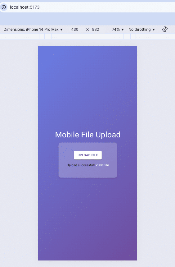
Output
When you run the project, open the browser’s Developer Tools (Inspect Element) and switch to mobile view. You can test how the UI adapts by selecting different mobile devices from the responsive mode in the inspector. This allows you to ensure a smooth and optimized experience across various screen sizes.
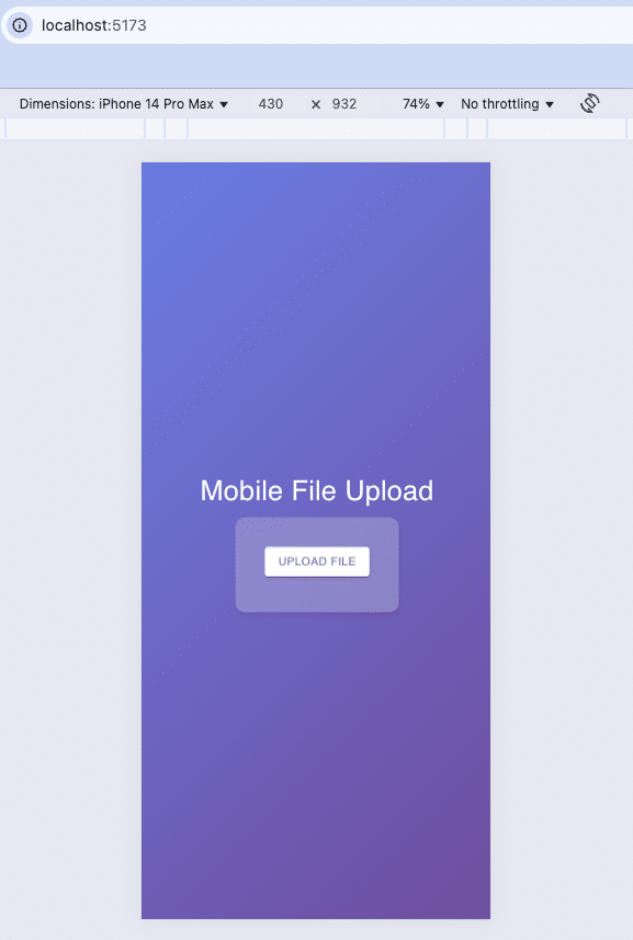
Click UPLOAD FILE:
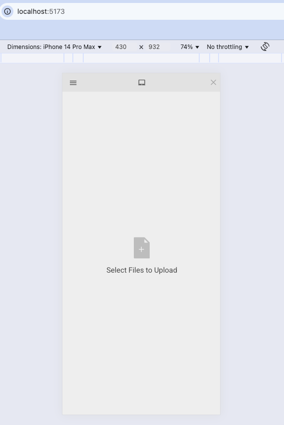
Then, you can drag and drop or tap here to browse and select the document. Here, I selected an image file.
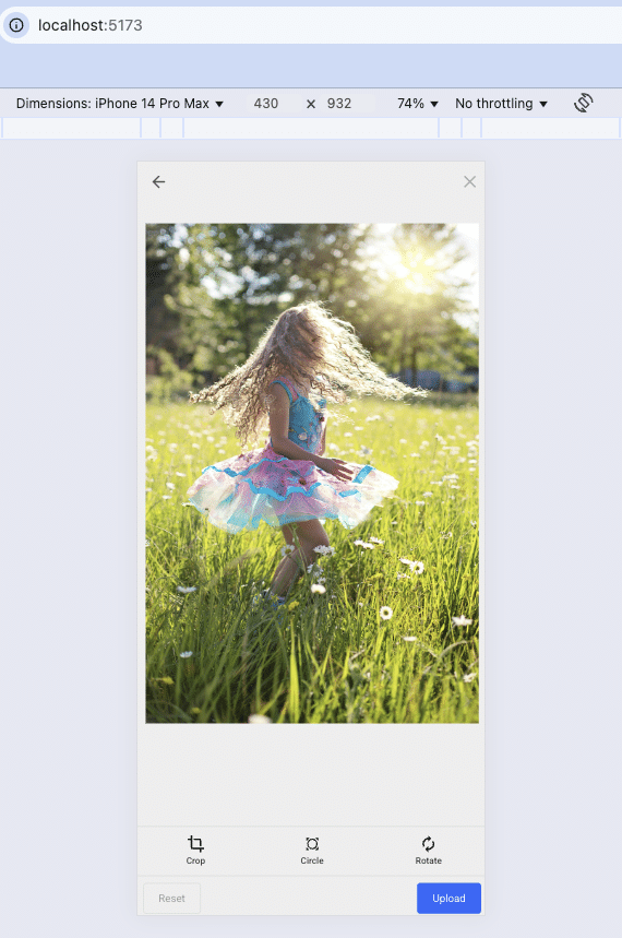
Then click the Upload button:

Conclusion
Mobile usability is no longer a nice-to-have; it’s a decisive factor in whether users stay engaged or abandon the process. For document-heavy applications, even small inefficiencies in the upload experience can result in lost conversions and eroded user trust.
By tackling common challenges—like limited screen sizes, slow uploads, and lack of feedback—developers can design mobile upload UIs that are smooth, intuitive, and accessible. Incorporating best practices such as responsive design, touch-friendly forms, and accessibility features ensures a user-first approach that resonates across devices.
Filestack’s mobile-focused upload solutions take this further by offering adaptive file compression, cloud integrations, and real-time progress tracking, helping businesses deliver seamless and reliable mobile file-handling experiences.
Investing in mobile usability today means higher engagement, stronger customer retention, and a competitive advantage tomorrow.
FAQs
What is mobile usability?
Mobile usability is how easily users interact with apps or websites on smartphones. A good mobile document upload UI ensures a smooth, user-friendly mobile file upload experience.
Why is usability important in mobile apps?
Strong usability improves engagement, retention, and conversions. A responsive file upload design or mobile-friendly upload interface makes tasks faster and frustration-free.
What is mobile usability in SEO?
Mobile usability impacts search rankings. Sites with optimized mobile file handling APIs, fast load times, and touch-friendly file upload forms rank higher and keep users engaged.

Shamal is a seasoned Software Consultant, Digital Marketing & SEO Strategist, and educator with extensive hands-on experience in the latest web technologies and development. He is also an accomplished blog orchestrator, author, and editor. Shamal holds an MBA from London Metropolitan University, a Graduate Diploma in IT from the British Computer Society, and a professional certification from the Australian Computer Society.
Read More →