Filestack has many tutorials on how to use Filestack to upload and process images. There are Instagram-like apps, YouTube-like apps, Soundcloud-like apps and more with JavaScript and Filestack’s API.
Typically, we go into great detail on the tech behind the app — showing step-by-step how to build out different elements of the app from scratch. But what if you already have an awesome website built, and you simply want to add your file uploading functionality to it?
Well, this is the post for you! In the following sections, we will show you how to implement and style a file uploader with Bootstrap and Filestack.
We will use Filestack for the basic file uploading functionality. The Filestack API provides an out-of-the-box solution to upload files from multiple sources, including Facebook, Google Drive, Webcam, and more, and upon uploading each file a CDN URL is automatically generated that we can immediately use in our application. We will use Bootstrap, and re-style the file upload button to match our branding.
Alright, let’s go!
Bootstrap in Action
Bootstrap is one of the most popular responsive, mobile-first HTML, CSS, and Javascript UI frameworks on the web.
Nowadays, the majority of modern websites use (or are at least inspired by) Bootstrap, as it proposed a series of consistent rules to design responsive websites.
Bootstrap comes with predefined styles for various HTML components and really simplifies things for developers and designers alike. Plus, it’s very simple to extend and adapt to a specific color-scheme. For example, we are able to provide a sort of “Filestack feel” by changing the button colors and adding an image and glyph.
Bootstrap File Upload Styling
In order to upload a file, we usually start with an “upload” button for the user to click on that opens the file uploader, or “File Picker” as we call it.
You can host the Bootstrap assets on your server, but you may prefer to link to a CDN copy of the distributed files. If you’re trying this out in CodePen, you can simply search for “bootstrap” in the options dialog under CSS to add it in to your pen.
See the Pen
The Answer to Beautiful Bootstrap File Upload Styling by Filestack (@Filestack)
on CodePen.
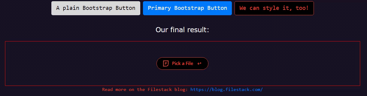
Bootstrap presents us with many pre-styled buttons, including a default file upload button similar to these pictured below. We are able to change the look and feel of the button. Look at this progression, with three different styles applied to the same Bootstrap-provided button side-by-side:

The first one has only the base CSS class “btn” from bootstrap that gives it the initial button shape.
<button class="btn">Upload</button>Bootstrap uses a second class to extend the base class with style. So, the second button has two classes: btn & btn-primary.
<button class="btn btn-primary">Upload</button>The button is now usable and responds to the mouse actions such as focus and hover. If you are interested in digging into it, take a look a the official Bootstrap documentation.
To style the third button we can follow the same philosophy and rely on the base class btn with a new class btn-filestack.
Let’s take a look a the CSS class first:
/* Feel free to change the background-color and border-color to fit your website's color scheme */
.btn-filestack {
 background-color: black;
 border-color: #ee4632;
}
.btn-filestack,
.btn-filestack:hover {
 color: #ee4632;
}
.btn-filestack:hover {
 //background-color: #330000;
 box-shadow: 0 2px 2px 0 rgba(256,256,256,0.24), 0 6px 6px 0 rgba(120,120,120,0.19);
}
.btn.btn-filestack:focus {
 color: #fff;
 outline: none;
}
It’s mostly a matter of setting the right color during a specific state. Notice our hover state includes a box-shadow, but any styles you specify in that style block will apply when the user’s mouse is over the button.
Also, pay attention that we need to make sure to overwrite the original btn style by specifying the text color we want; the more we change, the more we overwrite default values to achieve the look and feel we’re going for.
We chose Filestack’s signature button colors, but feel free to customize it! Because we have these custom styles in our code, we can now do this:
<button class="btn btn-filestack">Upload</button>The button says “Upload”, but if we click it right now of course nothing will happen. We will add a couple lines of JavaScript later for that, but we’re looking at the styling only here. Now, following the Bootstrap philosophy of adding specialized classes, we are ready to implement the widget with our company logo!
Styled Upload Button
First, let’s get a clear idea of what we are trying to achieve. We would like our final button to invite the user to click on it, and display with the company logo on the left side of the button, like this:

We can definitely reuse the classes btn and btn-filestack plus a new btn-widget CSS class to handle these further customizations:
<button class="btn btn-filestack btn-widget">Pick File</button>Let’s start working on the border and size. We can use border-radius to round the borders, and also add some padding. In addition, let’s make sure the font-size is 12px like the original, with font-family set to Open Sans, and font-weight at 600.
Let’s take a look a the CSS:
.btn-widget, .btn-widget:active {
  font-family: "Open Sans", sans-serif;
  font-size: 12px;
  font-weight: 600;
  border-radius: 17px;
  padding: 4px 30px 5px 40px;
  height: 34px;
  /* Set the path of your logo */
  background-image: url('https://www.filestack.com/favicon.ico');
  background-size: 16px 16px;
  background-position: 16px 8px;
  background-repeat: no-repeat;
  line-height: 23px;
}
Notice we also added 34px for the height. Now, let’s add the right arrow.
We’ll map a little UTF-8 character with a hooked arrow on to the button as well, to draw attention to its uploady-ness:
.btn-widget::after {
  position: relative;
  content: "\21a9";
  color: rgb(239,74,37);
  top: -0px;
  right: -11px;
  width: 1px;
  height: 12px;
  background: 0 0 no-repeat;
}
Finally, we want to add the company logo to fill the left space.
The icon styling is a bit tricky. In few words, we are going to define a fixed size for the background to equal the icon size, then provide a fixed position and the attribute no-repeat. By doing so the background does not cover all the button but instead takes care of the icon styling.
Great, in few minutes we created an elegant styling you can immediately use in your website!
Filestack Pick Function
To end in style let’s go ahead and add a click event listener on the button:
<p id="final_result">
  <button id="final_button" class="btn btn-filestack btn-widget">Pick a File</button>
</p>
final_button is the id of the final button, so we attach a function triggered by user’s clicks to launch the Filestack File Picker:
var fs_button = document.querySelector("#final_button");
fs_button.addEventListener("click", function() {
  var client = filestack
  .init(apiKey)
  .picker({
    fromSources: [
      'local_file_system',
      'url',
      // 'imagesearch',
      'facebook',
      'instagram',
      'googledrive',
      'dropbox'
    ]
  }).open();
});
This JS code specifies the options we want for our picker, and then opens it up. Nothing is initialized until that click, but it happens super-fast. You could also choose to put this code outside of the event handler; keep an eye on those scopes!
Hopefully this has given you some inspiration for styling your own upload buttons in Bootstrap. As we’ve seen here, you can really customize away any defaults Bootstrap brings, but you’re still getting the benefits of the UI framework itself. Here is the code discussed above in a CodePen if you’d like to try it out yourself:
See the Pen
The Answer to Beautiful Bootstrap File Upload Styling by Filestack (@Filestack)
on CodePen.
Filestack is a dynamic team dedicated to revolutionizing file uploads and management for web and mobile applications. Our user-friendly API seamlessly integrates with major cloud services, offering developers a reliable and efficient file handling experience.
Read More →