
Most teams obsess over landing pages, checkout flows, and onboarding sequences. File upload gets a button, maybe a spinner, and an afterthought. That’s a costly gap.
Whether it’s a job application, a creative brief submission, a medical record upload, or a product image, the moment a user needs to attach a file is a moment of real friction. Get the interface wrong, and they leave. Get it right, and the interaction feels almost invisible.
This guide covers the core components of effective upload UI: drag-and-drop zones, progress indicators, file preview patterns, and validation workflows. For each, we look at what works, what doesn’t, and how the pieces fit together to create an experience that converts.
Key Takeaways
- A well-designed upload UI with clear drag-and-drop zones, visible progress, and file previews measurably reduces form abandonment.
- Progress indicators: linear bars, percentage counters, or step trackers, are the single biggest lever for reducing mid-upload drop-off.
- File previews before submission reduce errors and build user trust by giving people a chance to verify before committing.
- Inline validation with specific, actionable error messages dramatically outperforms generic “upload failed” notices.
- Mobile-first design, keyboard navigation, and screen reader support are table stakes, not optional extras.
Why Upload UI Matters
Upload UI sits at an intersection most product teams underestimate: it’s both a functional requirement and a conversion variable. Get it right, and users barely notice the interaction. Get it wrong, and they notice immediately, usually by leaving.
The Upload Experience Impacts Conversions
A confusing or unreliable upload interface doesn’t just create friction; it ends sessions. Consider the practical consequences:
- Abandoned forms: When users can’t figure out how to attach a file or receive no feedback after trying, they leave the form entirely rather than troubleshoot.
- Incomplete applications: In hiring, insurance, finance, and healthcare, upload steps are often mandatory. A broken upload experience means an incomplete submission, which means lost data and lost users.
- Reduced engagement: Users who encounter upload friction once are less likely to attempt uploads in the future, depressing feature adoption across the product.
- Lower conversion rates: For any flow where file upload is a required step before a sale, sign-up, or activation, upload drop-off directly suppresses conversion.
The upload step is rarely the star of any user flow, but it’s often the reason the flow fails.
User Expectations Have Changed
The bar for upload UX has risen sharply. Users who interact with polished consumer apps daily carry those expectations into every digital product they touch. What feels like a reasonable baseline now includes:
- Instant feedback: Any lag between action and response is felt as a malfunction, not a normal wait.
- Mobile-friendly uploads: The assumption that uploads happen on desktop is years out of date; mobile-first design is mandatory.
- Real-time progress tracking: Users expect to see something moving, not just a spinner with no information.
- Fast, intuitive interactions: Drag-and-drop, tap-to-browse, and camera integration should work without instruction.
Meeting these expectations isn’t a competitive advantage; it’s the cost of entry.
Upload UX Directly Affects Trust
Beyond conversion, the upload UI is a trust signal. When an interface is transparent about what it’s doing: showing file names, progress, confirmation states, and specific errors, users feel in control. When it’s opaque, silent on progress, vague on failure, absent on confirmation, users don’t know whether to wait or start over. That uncertainty is corrosive. It erodes confidence not just in the upload step but in the product as a whole.
Reliability and transparency in the upload UI translate directly into perceived product quality.
What Is Upload UI?
Upload UI refers to the visual interface and user experience components that allow users to select, upload, monitor, and manage files within an application. Common elements include drag-and-drop zones, progress indicators, file previews, and validation messages.
A good upload UI answers three questions the user always has:
- How do I add a file? A clear, discoverable entry point.
- What’s happening? Real-time feedback that something is progressing.
- Did it work? Confirmation or a clear path to fix an error.
Miss any of these and trust erodes. Users don’t retry failed uploads; they abandon and move on.
Core Elements of an Effective Upload UI
Before diving into individual components, it helps to see the full picture. Strong upload interfaces share the same structural building blocks regardless of the product they live in.
File Selection Interface
Users should never have to guess how to start an upload. The most reliable approaches combine:
- A drag-and-drop zone: Large, clearly bounded, with a dashed or accented border that signals interactivity.
- A click-to-browse fallback: Because drag-and-drop fails on mobile and for keyboard users.
- Mobile camera and gallery integration: Native file pickers on iOS and Android should trigger automatically on touch devices.
Upload Status Visibility
From the moment a user selects a file, they need feedback. Even a few seconds of silence feels like failure. Status visibility means showing something is happening at every stage, not just at the end.
Error Handling
Clear, specific error messages beat generic ones every time. “File must be under 10 MB” is useful. “Upload failed” is not. The best error handling tells users exactly what went wrong and exactly what to do next, with a one-click way to try again.
Accessibility Considerations
Upload components are easy to build inaccessibly. Keyboard navigation, visible focus states, meaningful aria-label attributes on controls, and sufficient color contrast aren’t optional; they expand your usable audience and often improve the experience for everyone.
Drag-and-Drop Upload Interfaces
The drag-and-drop zone has become the default mental model for file uploads on the web. Users expect it, and when it’s missing or hard to find, it creates unnecessary friction.
Why Drag-and-Drop Improves User Experience
Dragging a file from the desktop directly into a web application removes several steps: no navigating a system file picker, no remembering where the file is, no multi-click path. For power users uploading frequently, the time savings compound quickly. For all users, the gesture feels more direct and less disruptive to the workflow they were in.
Key Components of a Drag-and-Drop Zone
Here are some key components of a drag-and-drop zone:
Clear Visual Boundaries
The drop target needs to be obvious. A defined area with a dashed or contrasting border, a neutral fill, and sufficient size signals “files go here” without needing to explain it. Zones that are too small, too subtle, or embedded in dense layouts get missed.
Hover and Active States
When a user drags a file over the zone, the interface should respond with a border color shift, a slight background change, or a subtle scale effect. This micro-interaction confirms the file is in the right place before the user releases it.
Supported File Information
Ambiguity kills completion. State the accepted file types, size limits, and quantity restrictions directly in the drop zone, not buried in help text elsewhere. “JPG, PNG, PDF, max 50 MB, up to 10 files” is all users need.
Best Practices for Drag-and-Drop Uploads
- Always pair drag-and-drop with a visible click-to-upload button; it’s the fallback that makes the component work everywhere.
- Validate files immediately on selection, not after a separate “submit” action.
- Support multi-file selection from the start if your use case will ever need it.
- Keep the zone responsive: on mobile, the drag affordance disappears, so the component should gracefully become a large tap target.
Common Mistakes to Avoid
Hiding the upload option inside a collapsed section, failing to show any visual change during hover, and offering no mobile-compatible alternative are the three mistakes that reliably cost completions.
Progress Indicators That Keep Users Engaged
Once a file starts uploading, the user’s primary question is: how long is this going to take? Leave that unanswered, and abandonment spikes, especially on larger files or slower connections.
Why are upload progress indicators important?
Upload progress indicators provide real-time feedback about transfer status, reducing uncertainty and helping users understand how long an upload will take to complete. Without them, users have no signal to distinguish a slow upload from a broken one.
Types of Upload Progress Indicators
Here are the main types of upload progress indicators:
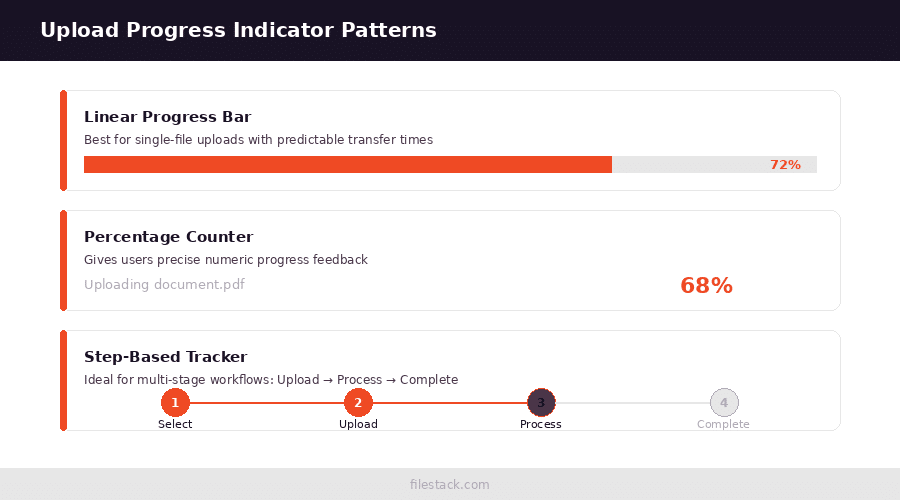
Linear Progress Bars
The most common pattern, a bar that fills from left to right as bytes transfer. Works well for single-file uploads where progress is predictable and continuous. The key is accuracy: a bar that jumps or stalls damages trust more than no bar at all.
Percentage-Based Indicators
Adding a numeric percentage alongside a bar (or as the primary indicator) gives power users the precision they want. “68%, about 4 seconds remaining” converts a vague wait into a concrete commitment. Use an estimated time remaining where possible.
Step-Based Progress Tracking
For uploads that involve multiple stages – upload, process, validate, complete, a step tracker communicates that progress is happening across phases, not just bytes. This is especially valuable when post-upload processing takes meaningful time. Labels like “Uploading”, “Processing”, “Optimising”, and “Complete” let users see where they are in a workflow, not just a transfer.
Real-Time Status Messages
Text updates beneath a progress bar (“Uploading 3 of 5 files…”, “Optimising images…”) add a layer of transparency that keeps users oriented. They also double as reassurance that a long pause is expected, not a failure.
Moving from selecting files to uploading them should feel continuous; progress indicators are the thread that connects those two moments.
File Preview Patterns
Previews serve a specific, practical function: they let users verify that what they uploaded is what they intended to upload, before it’s too late to change their mind.
The Value of Previews Before Submission
A user who uploads the wrong version of a document without a preview submits that error. A user who sees a thumbnail of the wrong document catches it in two seconds. Previews reduce support tickets, re-uploads, and user frustration in one shot.
Image Preview Interfaces
Thumbnail generation gives immediate confirmation that the file transferred correctly. Beyond confirmation, image previews can offer light crop or rotation tools that improve the final result without requiring external editing. Validation at preview time, flagging blurry images or mismatched aspect ratios, heads off problems before submission.
Document Preview Workflows
For PDFs and documents, a preview showing page count and basic metadata (“Marketing Brief v3.pdf, 12 pages, 4.2 MB”) gives users enough context to confirm they’ve selected the right file. A full-page render is rarely necessary for confirmation purposes.
Video Preview Experiences
Video thumbnails, duration display (“2:34”), and optional inline playback let users confirm both the content and the format. These are especially important when file formats matter; a user who uploaded a .mov when .mp4 is required benefits enormously from seeing that immediately.
Benefits of Preview Functionality
Previews consistently reduce errors at submission, increase user confidence, and make multi-file upload interfaces far more manageable. They turn the upload step from a black box into a reviewable action.
Upload Validation Patterns
Validation is the invisible safety net under every upload flow. When it’s done well, users rarely notice it. When it’s done poorly, it’s the reason they leave.
Validate Early and Clearly
Client-side validation on file selection, before anything is transferred, is faster and clearer than server-side validation after an upload. Checking file type, size, and count at the point of selection means users get feedback in milliseconds, not after waiting for a network round trip.
Common Validation Rules
Now, let’s look at some common validation rules:
File Type Restrictions
Enforce accepted MIME types and extensions, and communicate them clearly in the UI. “Only JPG, PNG, and WebP are supported” is unambiguous. A generic error after the fact is not.
File Size Limits
Display size limits before users select a file. When the limit is exceeded, show the actual file size alongside the limit: “Your file is 22 MB. Maximum allowed: 10 MB.” That’s actionable. “File too large” is not.
Quantity Restrictions
If the upload zone has a maximum file count, show it (“Up to 10 files”) and enforce it gracefully; don’t silently drop files beyond the limit.
User-Friendly Error Messaging
Good error messages have three parts: what went wrong, why it matters, and what to do next. “document_final_v2.pdf is 24 MB; the 10 MB limit prevents uploads this large. Try compressing the PDF before re-uploading.” That’s a complete message. Every upload error should meet that bar.
Recovery Options
After an error, the path forward should be obvious and require as few steps as possible. A “Replace file” button on an errored item is far better than asking users to start over from the beginning.
Mobile Upload UI Best Practices
Mobile upload is a different problem from desktop upload. The interaction model, the connection quality, and the file sources all change. Designing desktop-first and adapting for mobile consistently produces worse results than starting with mobile constraints in mind.
Design for Touch Interfaces
Touch targets need to be large enough to tap accurately, a minimum of 44×44px for interactive elements. Simplified interactions, fewer steps, and generous spacing matter more on a 390px screen than on a 1440px monitor.
Camera and Gallery Integration
On mobile, users are often uploading files that live on the device, photos from the camera roll, and documents from a cloud provider. The upload component should invoke native file pickers that surface these sources directly, rather than forcing users to navigate a generic file browser.
Responsive Upload Components
A drag-and-drop zone that looks great at 1280px but collapses into an unusable strip at 390px isn’t a responsive upload component; it’s a desktop component with mobile CSS. True responsiveness means the component is designed to work at every breakpoint, not just scaled.
Network-Aware Experiences
Chunked uploads, retry logic on failure, and clear feedback when a transfer stalls due to connectivity are table stakes for mobile. Users on cellular connections expect uploads to survive brief interruptions without losing progress.
Multi-File Upload Experiences
Single-file upload is a solved problem. Multi-file upload is where most upload UIs fall apart; the queue management, the status visibility, and the error recovery all get harder at scale.
Managing Multiple Uploads
A file queue interface shows each file as a discrete item with its own status. Users should be able to see, at a glance, which files have uploaded successfully, which are in progress, and which have errored, without reading carefully or inferring from aggregate indicators.
Batch Upload Controls
Useful controls for a multi-file queue include: pause and resume for individual files, retry on failure without re-selecting, and remove for files added by mistake. The goal is to give users control without requiring them to cancel and restart the entire upload.
Organising Upload Lists
Each item in the queue should display: the file name, an upload progress indicator, current status, and any error with a clear action. Truncate long file names gracefully; never let them break the layout.
Improving Visibility for Large Upload Sets
For uploads of ten or more files, filtering (show only errors, show only complete) and grouping by status reduce cognitive load substantially. Users shouldn’t have to scroll through forty completed uploads to find the two that need attention.

Designing Upload Flows That Convert
The individual components matter, but the flow connecting them matters just as much. A drag-and-drop zone that leads to an opaque upload experience, then a validation error with no recovery path, will still lose users, regardless of how well each piece looks in isolation.
Reduce Cognitive Load
Keep the upload interface focused. Every element on screen during an upload should either provide information or offer a relevant action. Decorative elements, unrelated navigation, and unnecessary choices during an active upload are distractions.
Minimise Required Steps
Every step between “user selects a file” and “file is successfully submitted” is an opportunity for drop-off. Reduce steps wherever possible: auto-submit on selection for simple use cases, avoid asking users to confirm what they just selected if a preview already served that function.
Build User Confidence
Transparency builds trust. Showing file names, sizes, and types during upload confirms the right file was chosen. Showing a success state with a checkmark confirms it worked. These moments of confirmation are low-cost and high-value.
Create Predictable Interactions
Consistency matters. The same upload component should behave the same way across every context it appears in. Users learn the pattern once; consistent behaviour rewards that learning; inconsistent behaviour requires them to re-learn each time.
Measure Upload Funnel Performance
Upload completion is a metric worth tracking with the same rigor as checkout completion. Useful measurements include: upload start rate, completion rate, abandonment rate by stage, error frequency by error type, and retry rate. Spikes in any of these signal specific problems to investigate.
Advanced Upload UI Features
As upload infrastructure matures, new patterns are emerging beyond the basics.
Resumable Upload Indicators
For large file uploads or unreliable connections, resumable uploads, where a transfer can be interrupted and restarted from the point of failure, need dedicated UI. Users need to see that the upload is resumable, where it was interrupted, and what “resume” means in practice.
Real-Time Processing Feedback
Post-upload processing (image optimisation, virus scanning, format conversion) can take longer than the transfer itself. Showing processing stages: “Scanning”, “Optimising”, “Ready”, prevents users from thinking the upload has stalled when it hasn’t.
Cloud Source Integrations
Allowing users to upload from Google Drive, Dropbox, or similar cloud sources removes the friction of downloading a file locally just to re-upload it. These integrations are increasingly expected in professional and enterprise contexts.
AI-Assisted Upload Workflows
Emerging patterns include automatic categorisation of uploaded content, duplicate detection, content moderation, and smart metadata extraction. These aren’t the norm yet, but they represent the direction the upload UI is moving, from passive transfer to intelligent processing.
Key Features to Look for in Upload UI Components
When evaluating upload UI components, whether building from scratch or integrating a pre-built solution, these are the capabilities worth prioritising:
- Drag-and-drop support with click-to-browse fallback.
- Progress tracking at the file and batch level.
- File preview for images, documents, and videos.
- Mobile responsiveness, including native file picker integration.
- Accessibility compliance covering keyboard navigation and screen reader support.
- Error recovery with specific messages and direct retry paths.
- Multi-file management with per-file status and queue controls.
- Customisable design that fits within existing product aesthetics.
How Filestack Simplifies Upload UI Development
Building all of this from scratch is substantial work. The components are individually manageable, but the integration surface, handling edge cases across browsers, devices, file types, and network conditions, grows quickly.
Filestack’s file upload product provides prebuilt upload components that cover the patterns described in this guide: drag-and-drop zones, real-time progress, file previews, inline validation, and cloud source integrations. Rather than rebuilding solved problems, teams can integrate and customise a tested upload experience and ship faster.
That said, the patterns in this guide apply regardless of implementation approach. Whether you’re evaluating a third-party component, auditing an existing upload flow, or building something new, the same principles hold: clear affordances, immediate feedback, honest error messages, and a path to recovery when things go wrong.

Conclusion
Upload UI rarely gets the design attention it deserves, but it earns that attention back in conversion rates, user trust, and support volume reduction.
The patterns covered in this guide aren’t complex in isolation. A well-bounded drag-and-drop zone, a progress bar that reflects real transfer state, a thumbnail preview before submission, and an error message that tells users exactly what to fix, none of these are technically difficult. What makes them hard is getting all of them right, consistently, across devices, browsers, and file types, without letting any one piece break the chain.
The practical takeaway is this: treat every step in your upload flow as a moment where a user can either stay or leave. Give them a clear target to drop files into. Show them something moving the moment a transfer starts. Let them see what they’re submitting before it’s submitted. Tell them specifically what went wrong when something does. And make recovery one click, not a form reload.
When those pieces connect, the upload step stops being a friction point and starts being something users don’t think about at all, which is exactly what good UI feels like.
For teams looking to skip the build-from-scratch path, Filestack’s file upload product packages these patterns into a production-ready component with drag-and-drop, progress tracking, preview support, and cloud source integrations built in. Whether you integrate a solution or build your own, the principles stay the same.
Frequently Asked Questions
What is the upload UI?
Upload UI refers to the visual components and interaction patterns that allow users to select, upload, monitor, and manage files within an application, including drag-and-drop zones, progress bars, file previews, and validation messages.
Why is drag-and-drop important for file uploads?
Drag-and-drop reduces friction by allowing users to transfer files directly from their desktop without navigating a multi-step file picker. It mirrors a familiar desktop interaction and speeds up repetitive upload workflows significantly.
How do upload progress bars improve conversion rates?
Progress bars eliminate uncertainty. When users can see that a transfer is actively progressing, they’re more likely to wait it out rather than assume something has broken and abandon the flow.
What types of file previews should upload interfaces provide?
Image uploads benefit from thumbnail previews with optional crop tools. Document uploads benefit from metadata display (file name, page count, size). Video uploads benefit from a thumbnail frame and duration. All previews should appear before final submission.
How can upload validation reduce user errors?
Client-side validation at the point of file selection, checking type, size, and count immediately, catches errors before a transfer starts. Pairing that with specific, actionable error messages and one-click retry paths removes the most common barriers to upload completion.
What makes a good mobile upload experience?
Large touch targets, native file picker integration for camera and gallery access, responsive layout across screen sizes, and network-aware behaviour (chunked uploads, retry on failure) are the foundations of a mobile upload experience that actually works.
How should multi-file uploads be handled in the UI?
Each file in the queue should show its name, upload progress, status, and any errors as individual items. Batch controls for pausing, retrying, and removing individual files give users meaningful control without requiring them to restart the entire upload.
What accessibility features should upload interfaces include?
Keyboard navigation through all interactive elements, visible focus states, aria-label attributes on controls and status regions, and sufficient color contrast are the minimum. Screen reader announcements for upload state changes (started, complete, error) significantly improve the experience for users relying on assistive technology.
How do resumable uploads affect user experience?
Resumable uploads remove one of the most frustrating failure modes: losing progress on a large file due to a brief network interruption. They need clear UI support; users should know the upload is resumable and see accurate progress when it resumes.
What should developers look for in upload UI components?
Drag-and-drop with fallback, progress tracking, previews, mobile responsiveness, accessibility compliance, specific error recovery, multi-file management, and customizable design. A component that handles the integration complexity across browsers and devices while supporting those patterns saves substantial development and QA time.
Shefali Jangid is a web developer, technical writer, and content creator with a love for building intuitive tools and resources for developers.
She writes about web development, shares practical coding tips on her blog shefali.dev, and creates projects that make developers’ lives easier.
Read More →